
VerreSkin
Results you can trust, in a bottle you'd leave on the counter.
Skincare splits into clinical-pharmacy cold or soft pastel that says nothing. Verre Skin wants both — efficacy you believe and packaging you'd display. The name is French for glass, and the whole system chases its two promises: transparency and clarity.
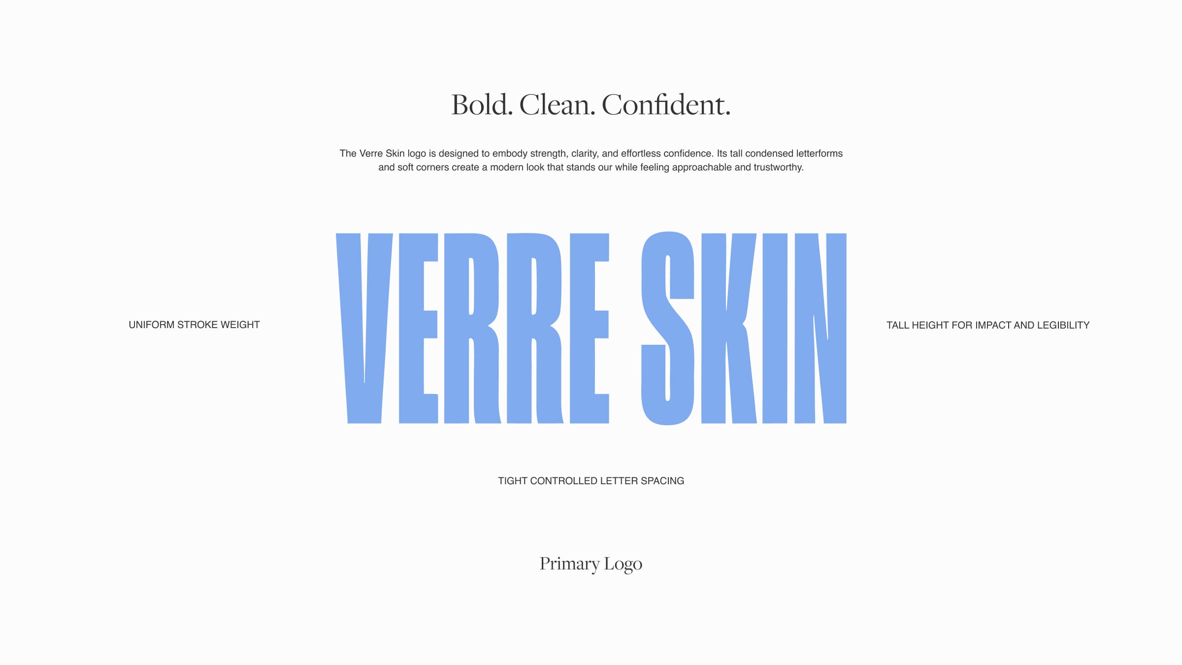
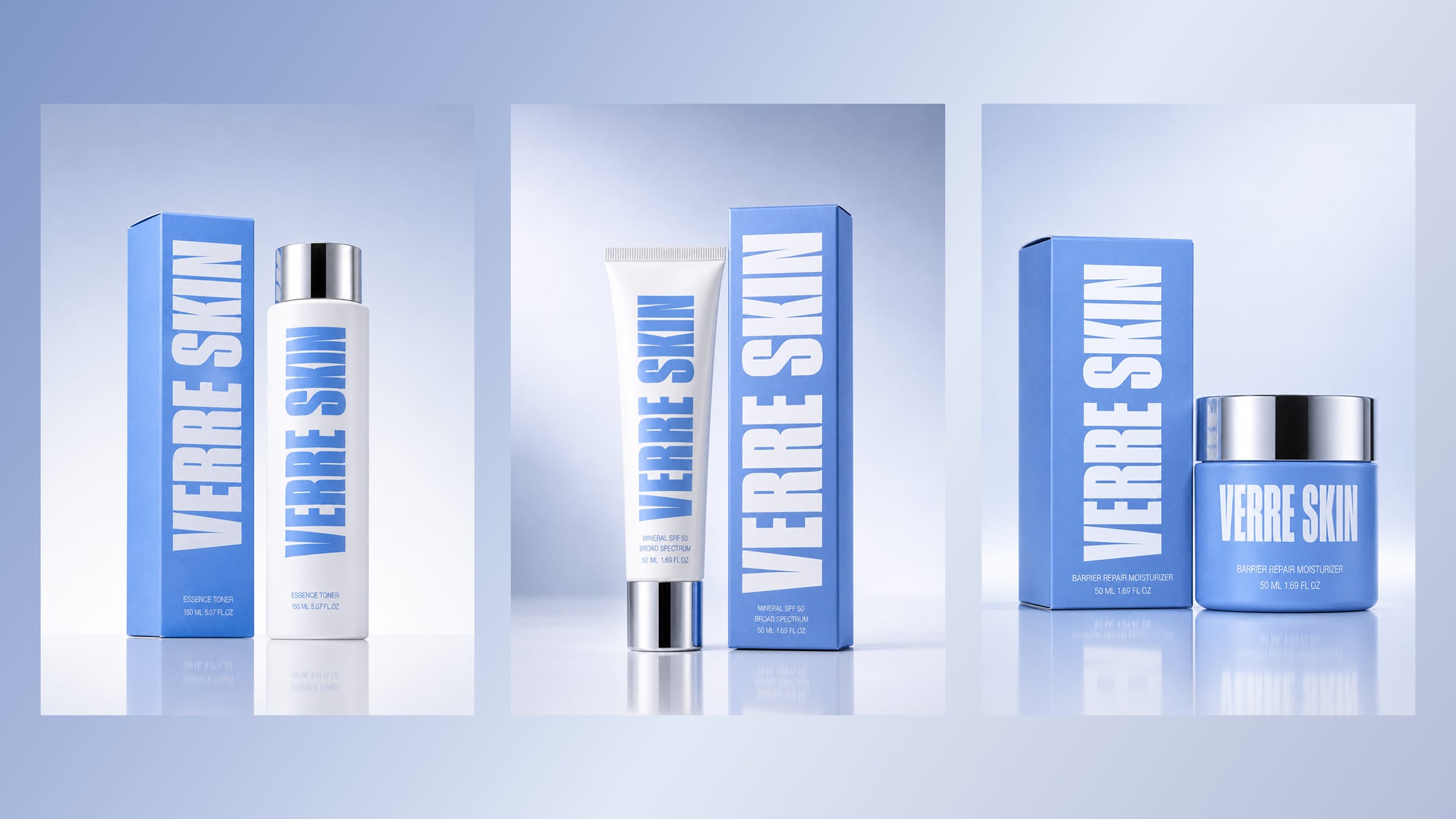
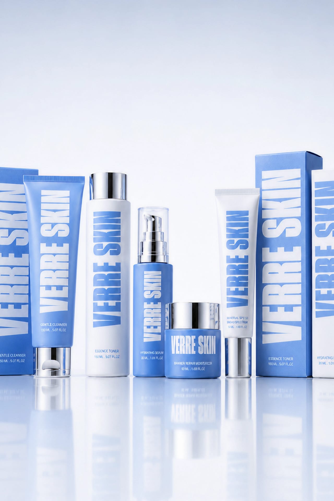
A tall condensed wordmark runs oversized up the side of every tube and jar until the name becomes the pattern. One cornflower blue against white, finished with a mirror-silver cap.
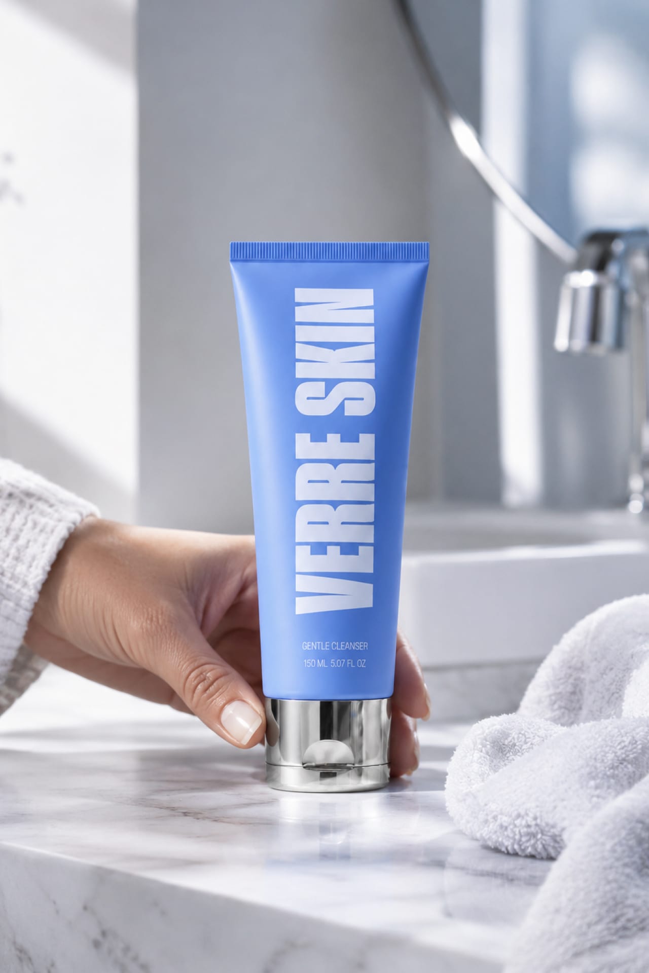
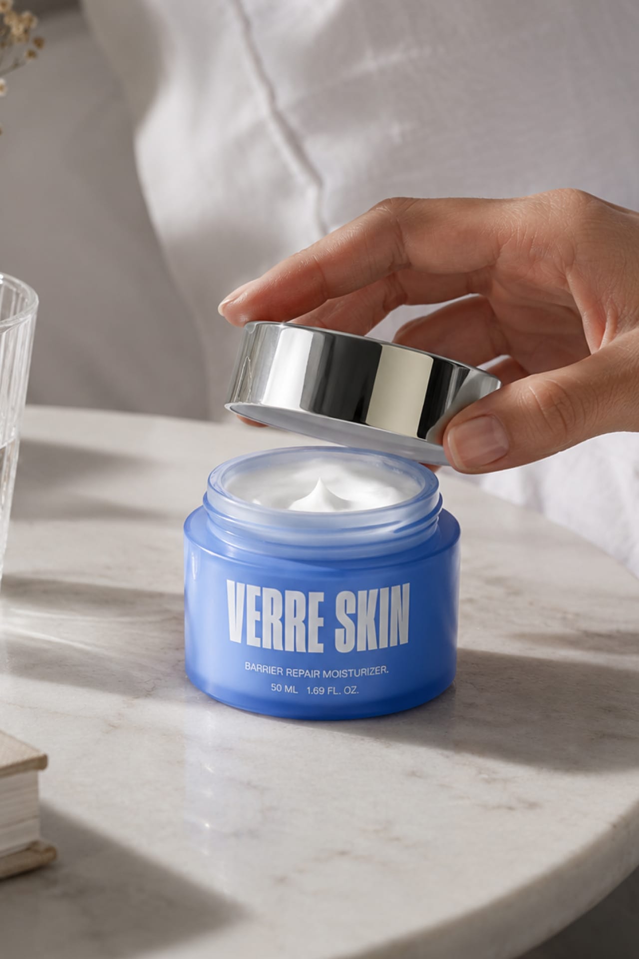
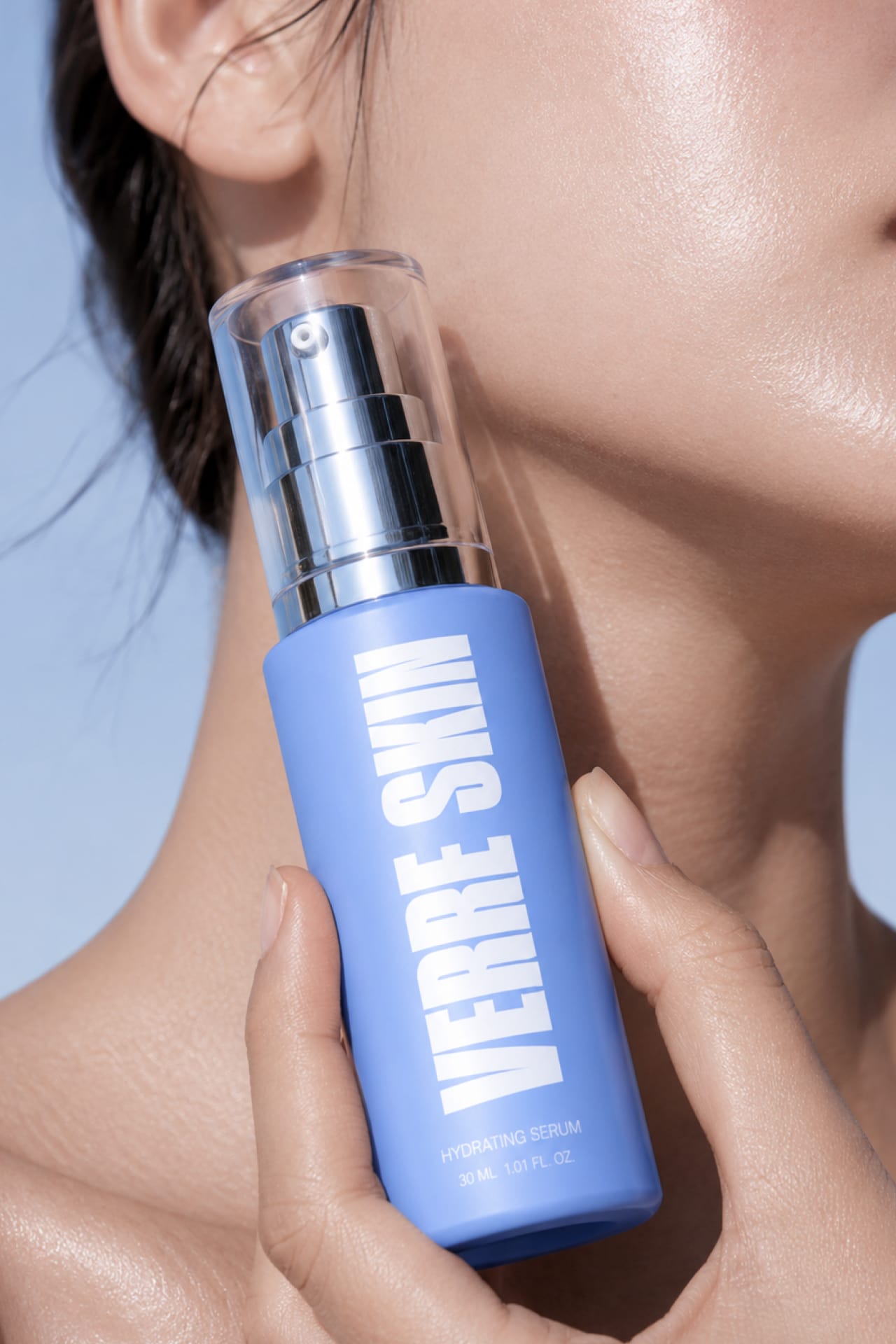

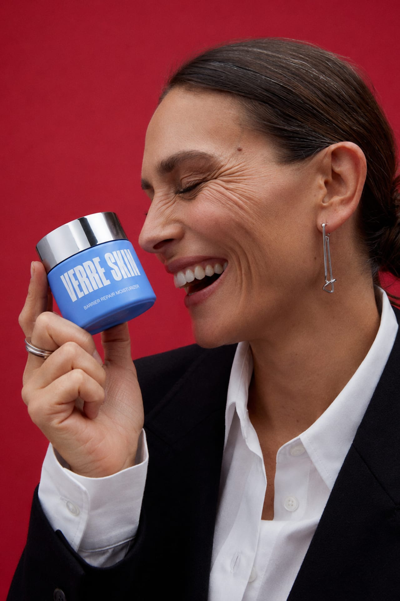
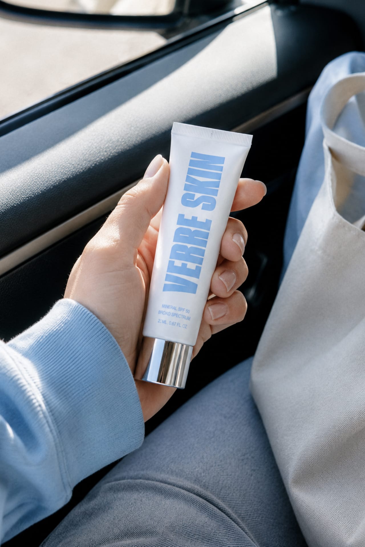
The five-step regimen — cleanser, essence toner, hydrating serum, barrier repair moisturizer, mineral SPF 50 — reads as one family at a glance, blue and white alternating across the line, the mirror-silver cap and vertical logotype the constants from travel-size to full toner. The art direction runs a saturated studio register, the wordmark blown up behind the subject, and a warmer lifestyle register that follows the routine into real rooms. Casting holds one idea: skin at every age, the same clarity standard regardless of decade.


Next project
Mira