
Mira
The best schedule is written before the rush, not during it.
Workforce software is spreadsheet-grey dashboards built for HR departments, not the person behind the counter. Mira is scheduling a café lead would actually want to open — confident, not corporate: forecast demand, build shifts to match, keep labour on budget.
The mark is two rising peaks forming an "m," topped with a lime dot — head, pin, spark of energy at once. Electric blue leads; rust coral and lime keep it from feeling clinical.
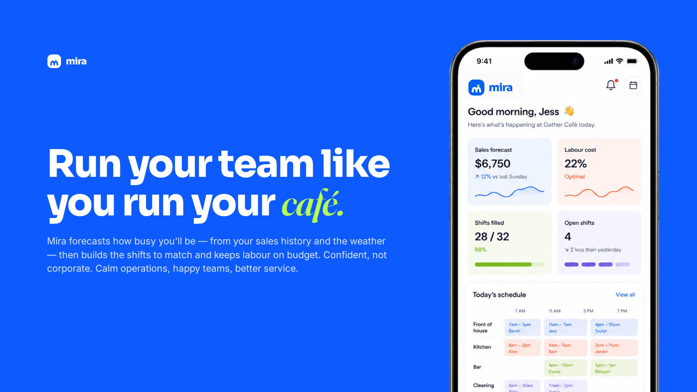
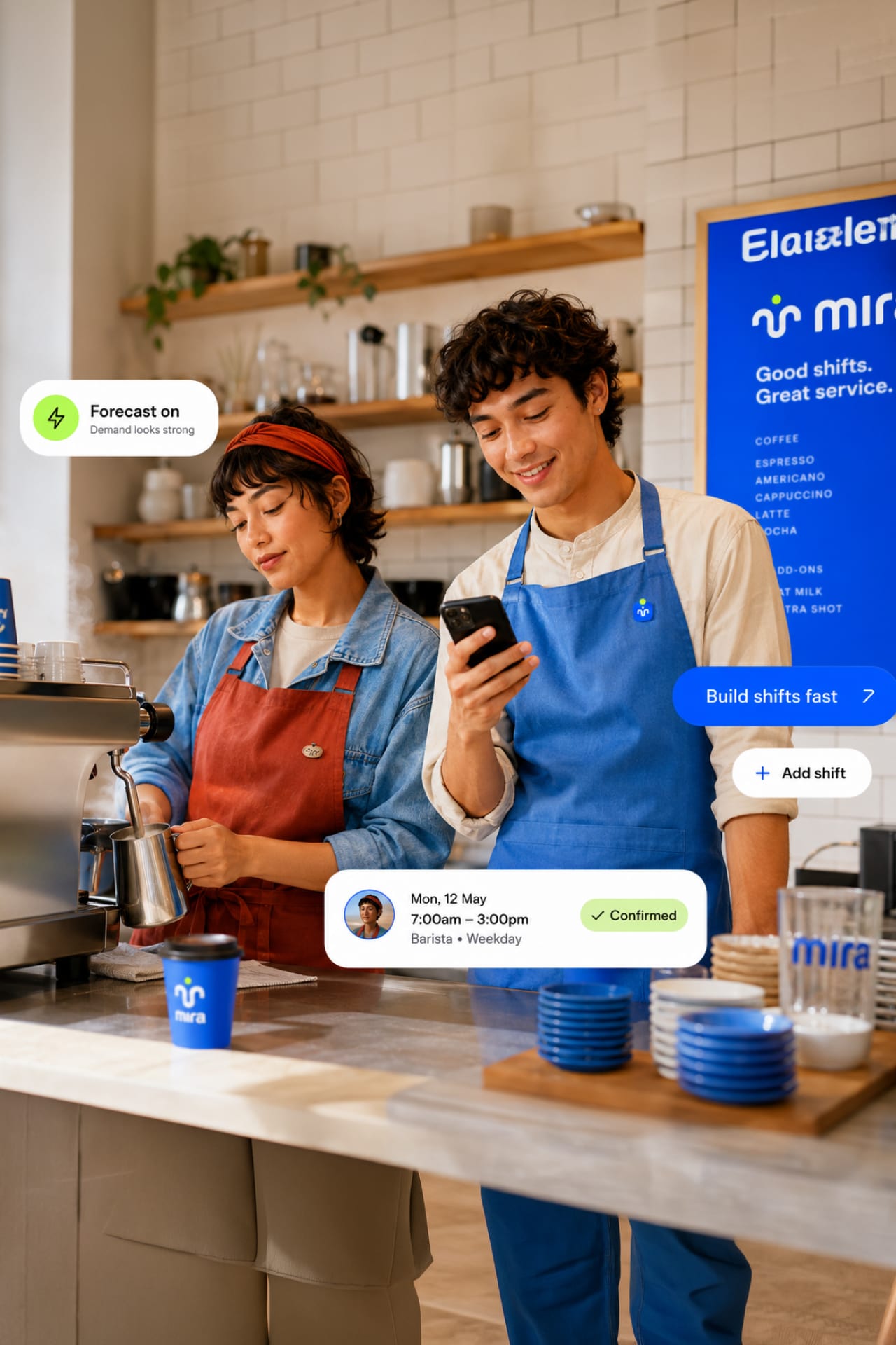
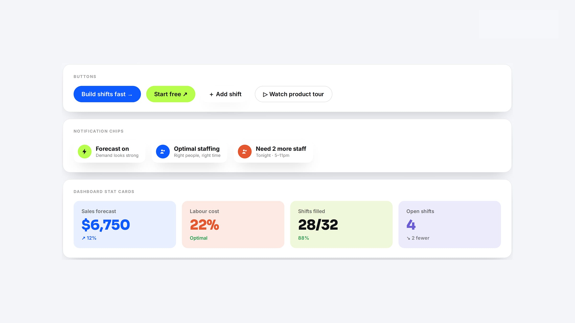
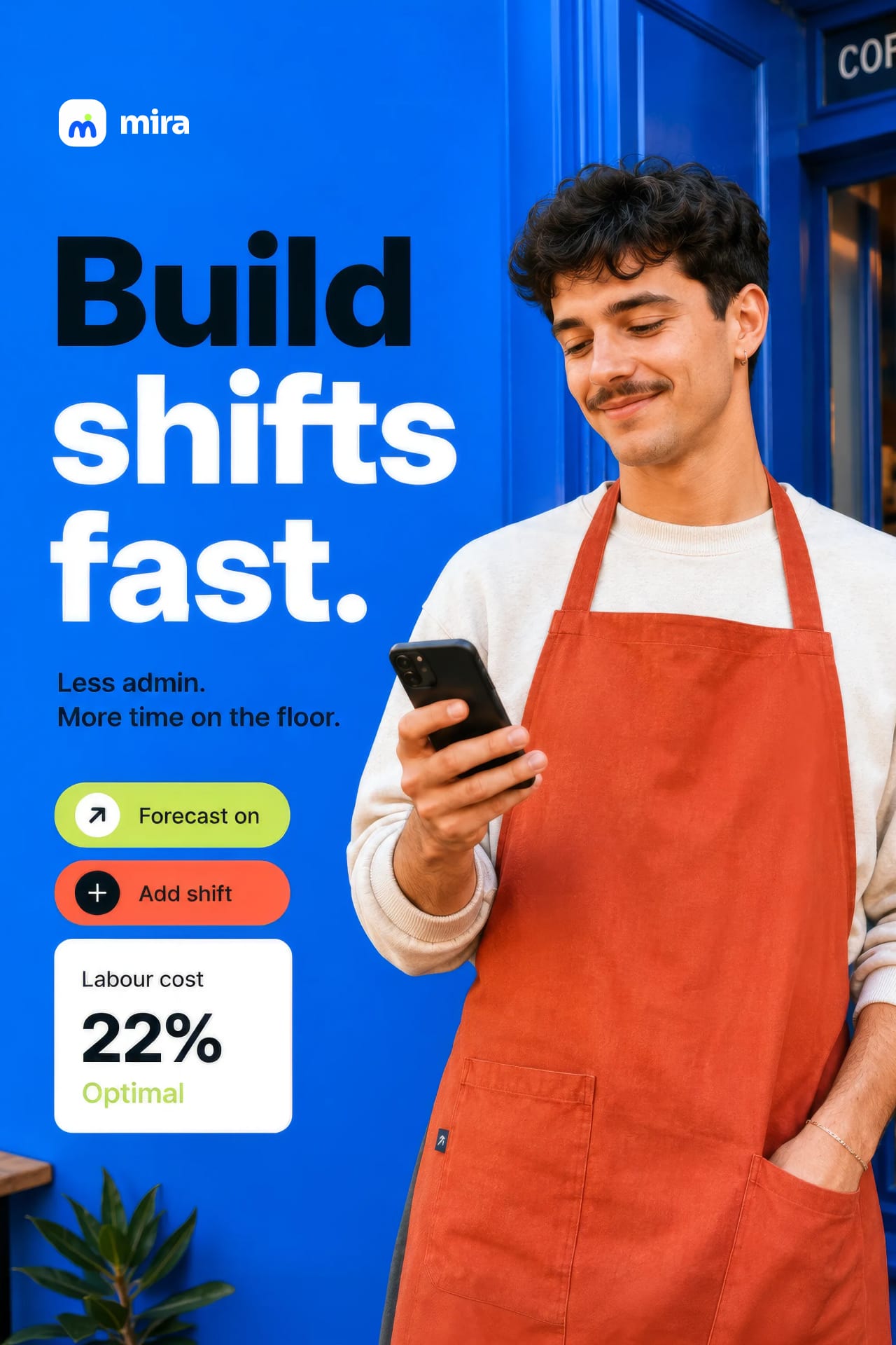
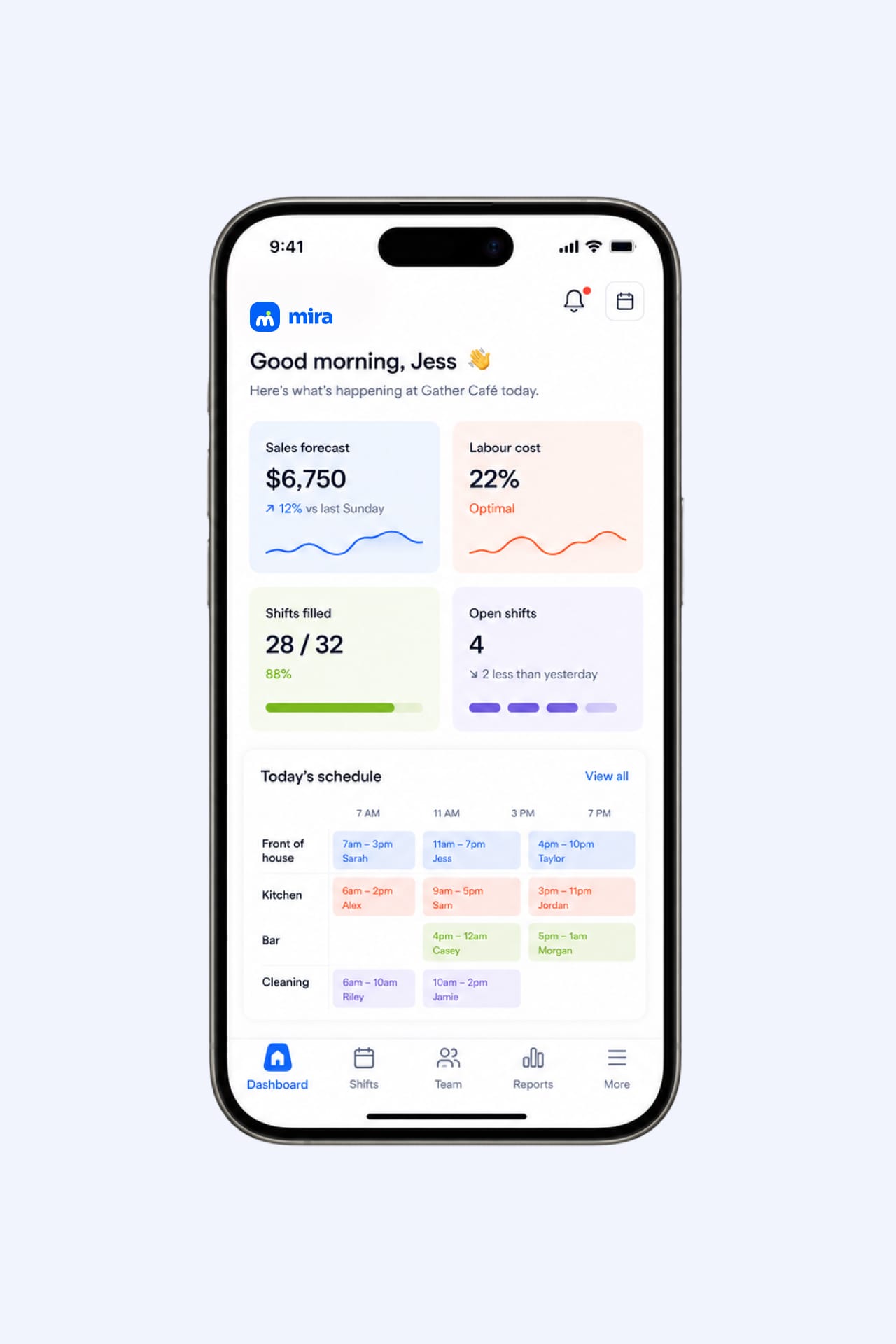
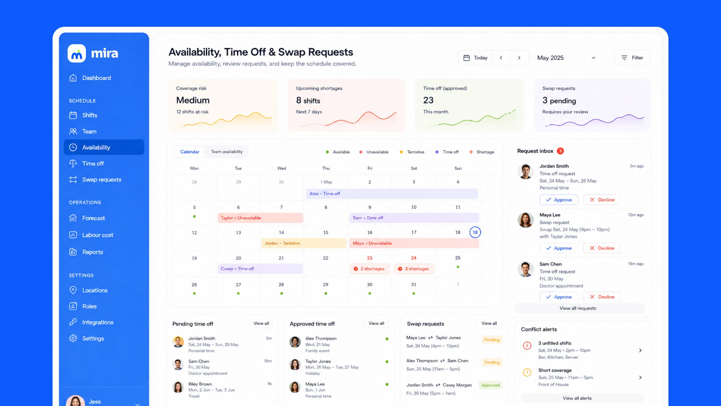
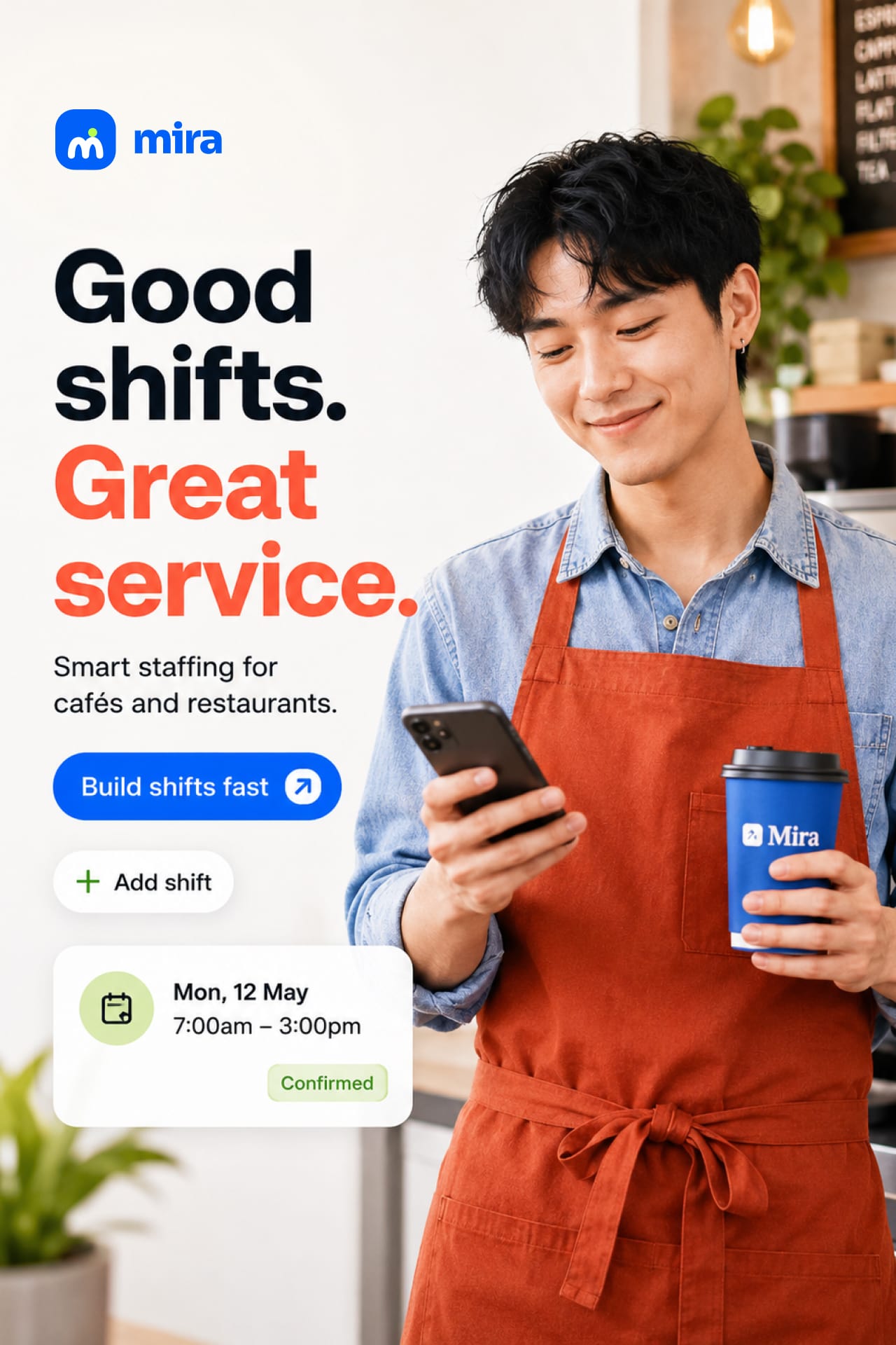
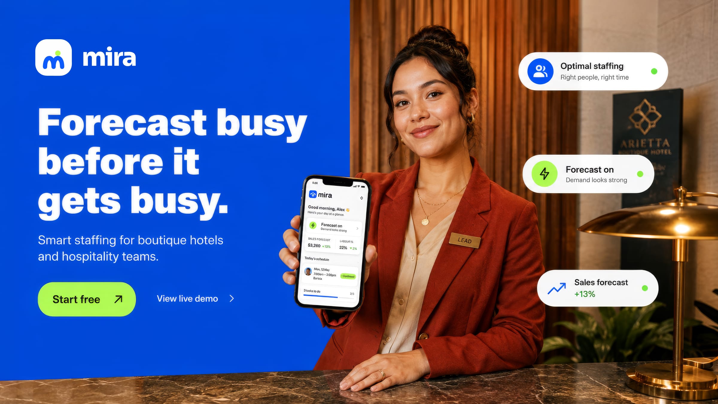
The product design does the heavy lifting — forecast, labour cost, filled and open shifts surfaced as colour-coded cards, availability and swap requests handled in a glance. The voice stays plain and human throughout: build shifts fast, forecast on, need 2 more staff. The campaign places it in the real world — boutique hotel desks, busy cafés, aprons and order rails — pairing the chunky headline with floating UI so the software reads as part of the shift rather than another screen.
Next project
Brasa