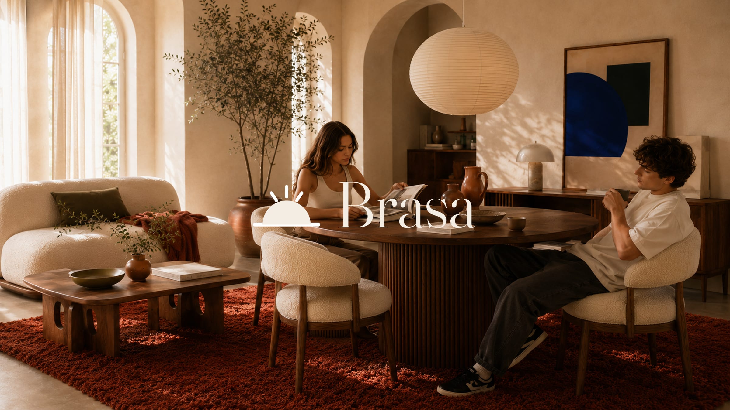
Brasa
A room that stops performing and starts being lived in.
Dubai's furniture market is crowded with showroom minimalism — cold stone, hard edges, rooms styled to be photographed rather than lived in. Brasa is the opposite: built for long shared evenings, not the catalogue page.
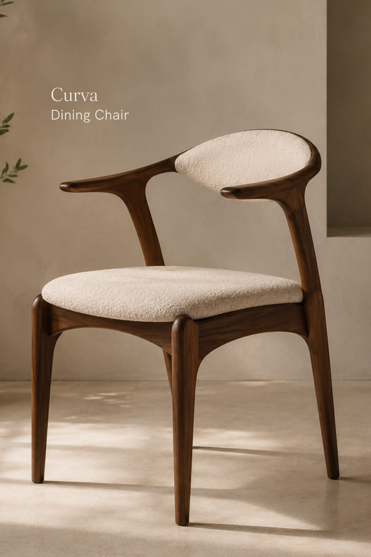
The identity centres on the Ember — a setting sun over a horizon, warm enough to carry the brand without the wordmark. Clay, terracotta and near-black tie it to the material world of walnut, bouclé and sunlit plaster.
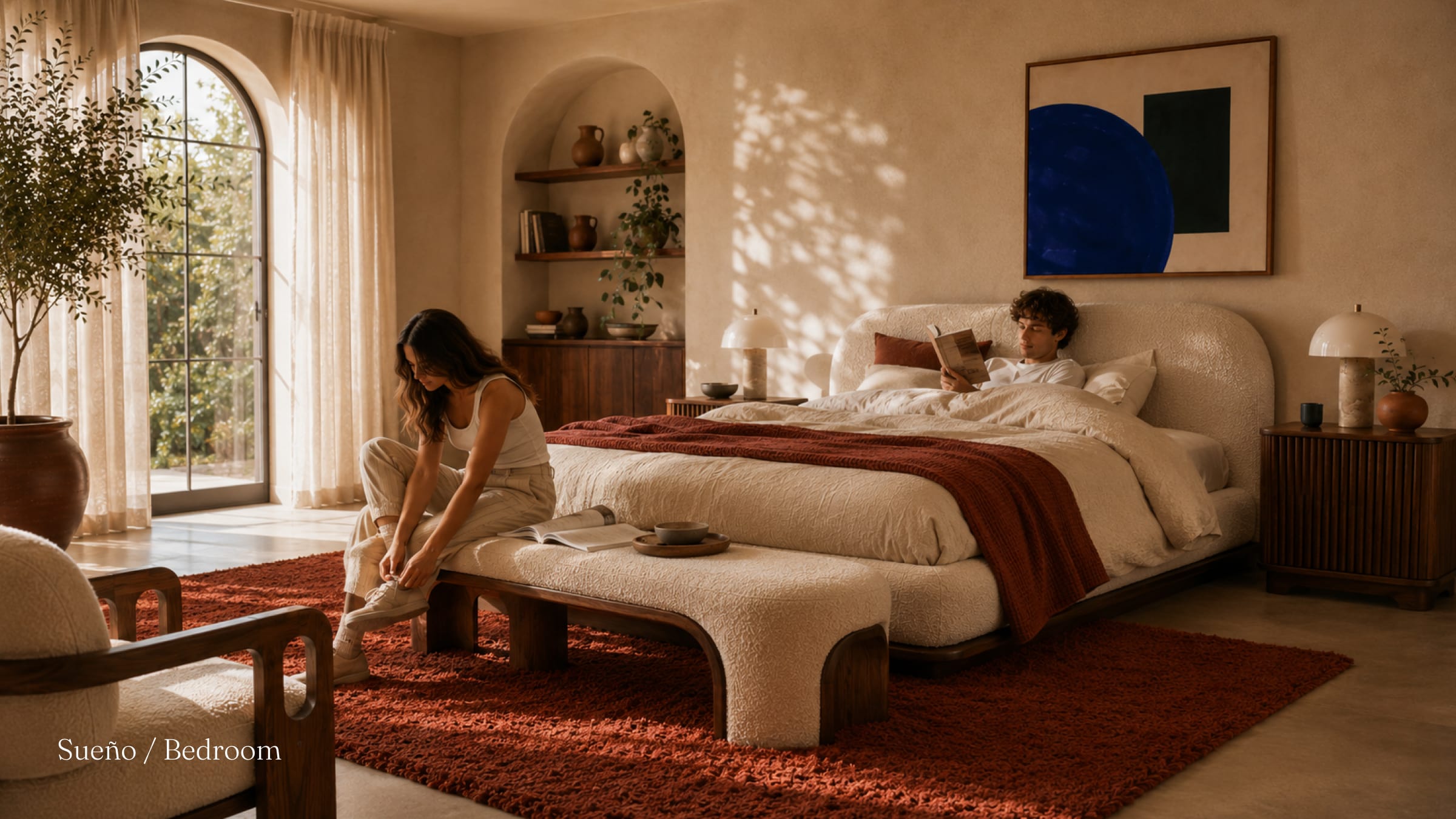
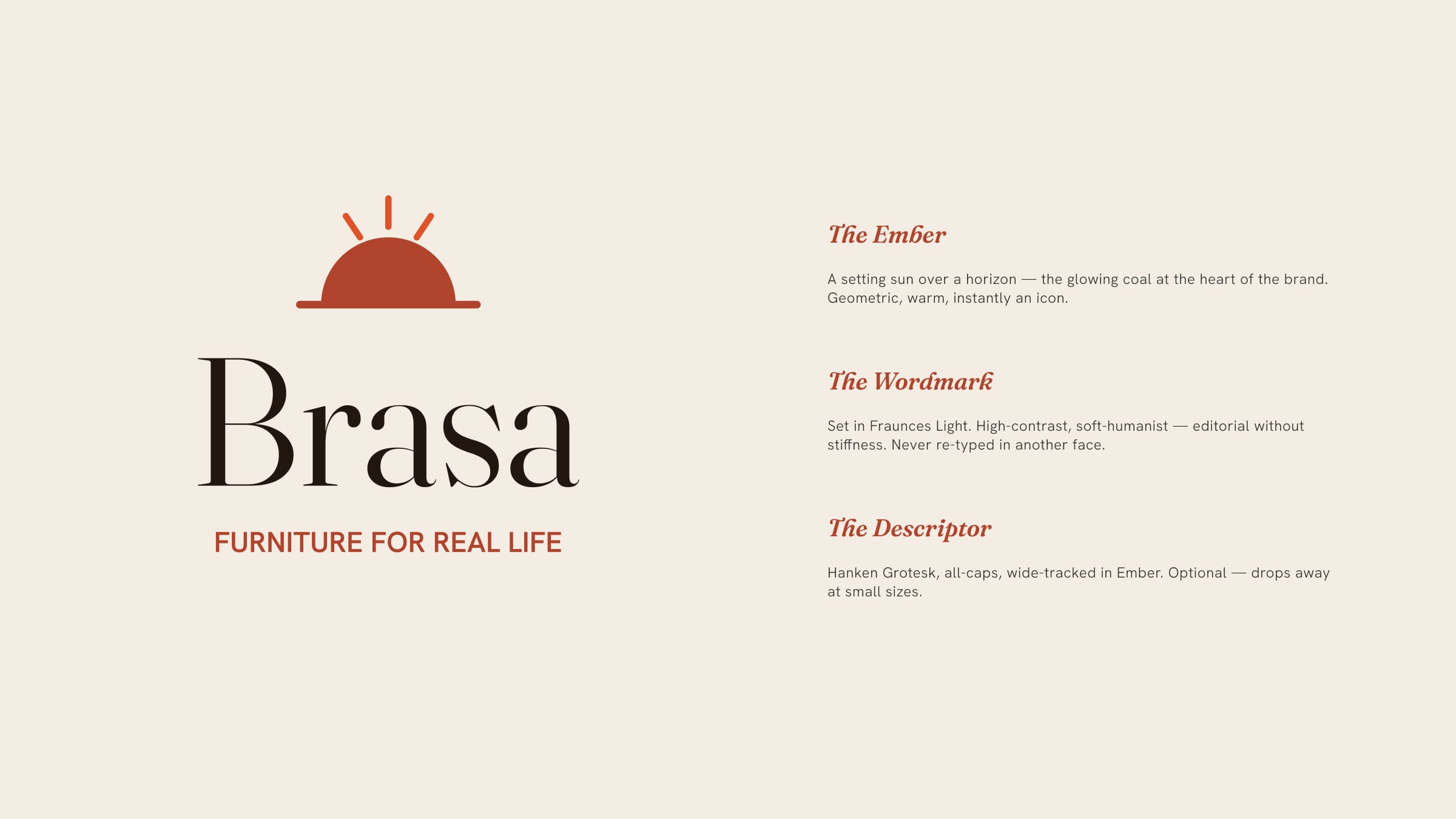
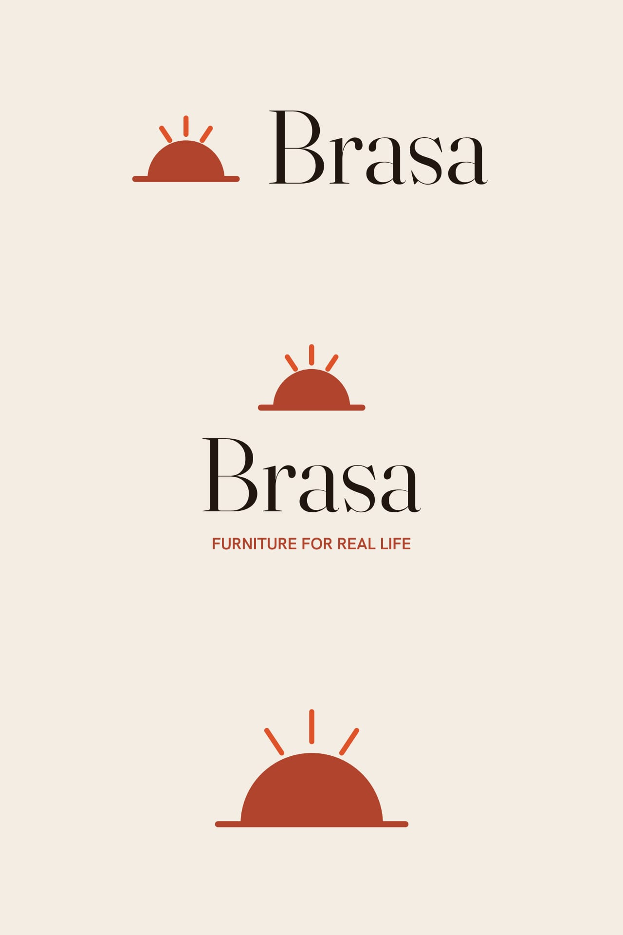
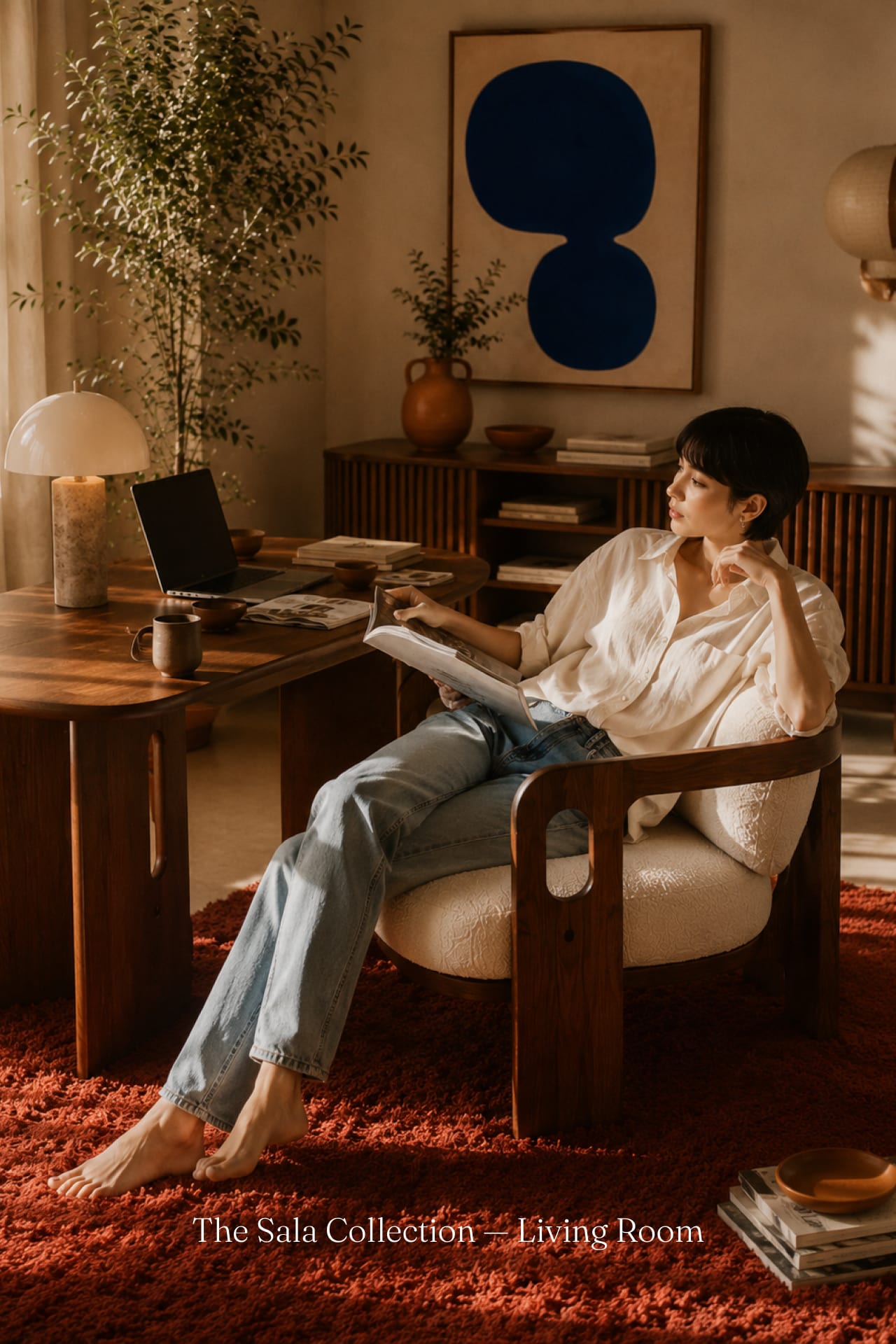
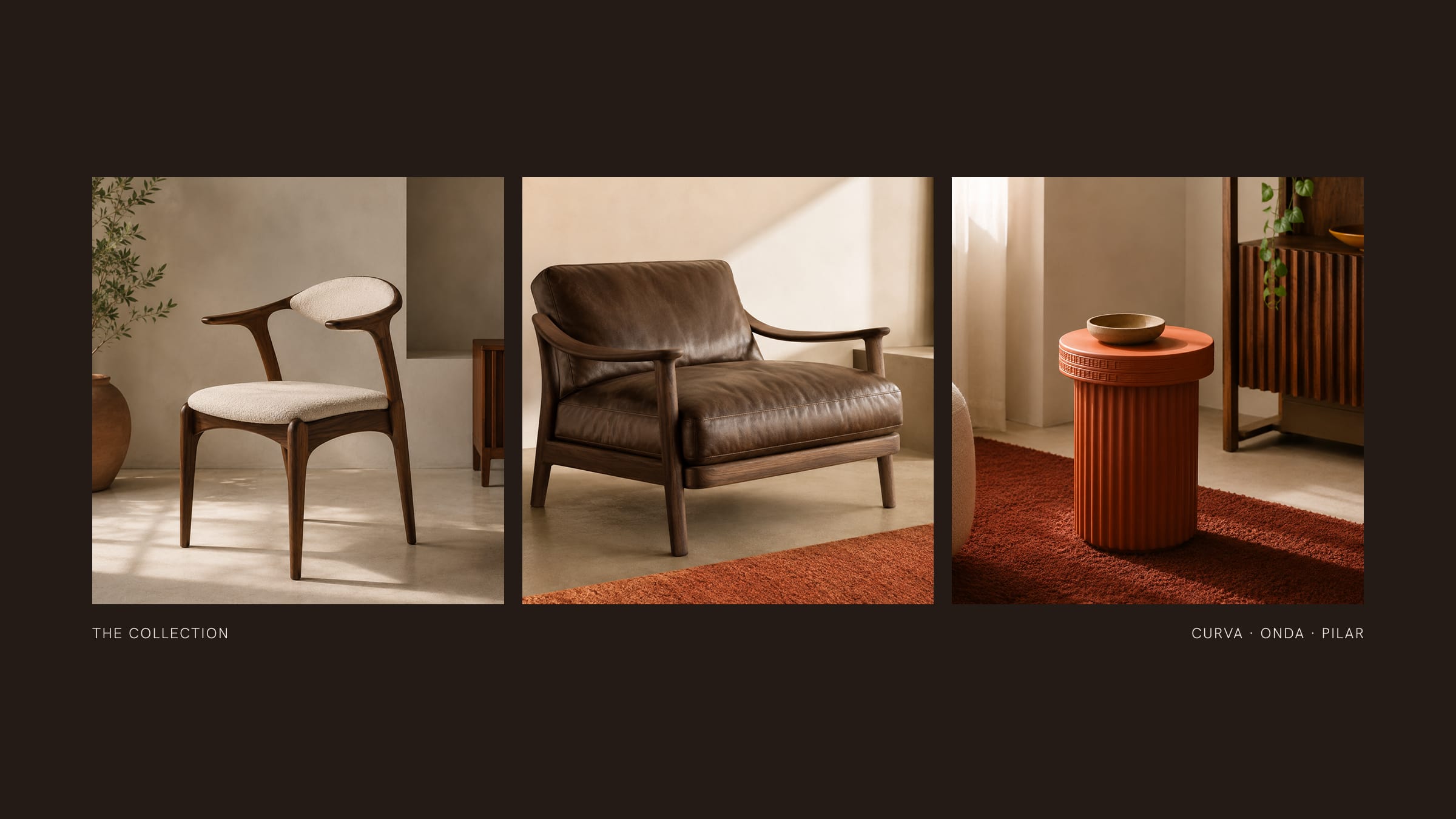
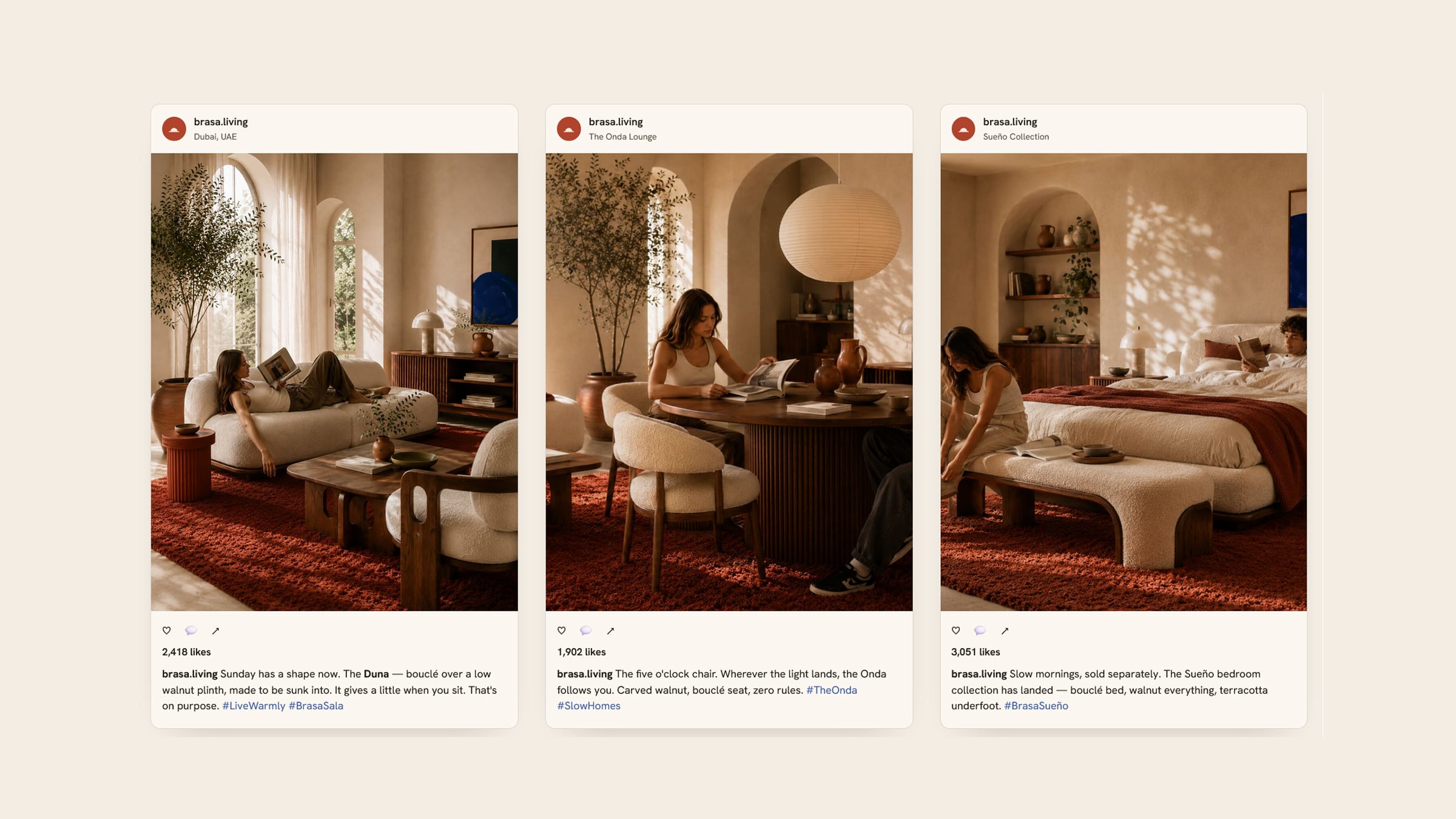
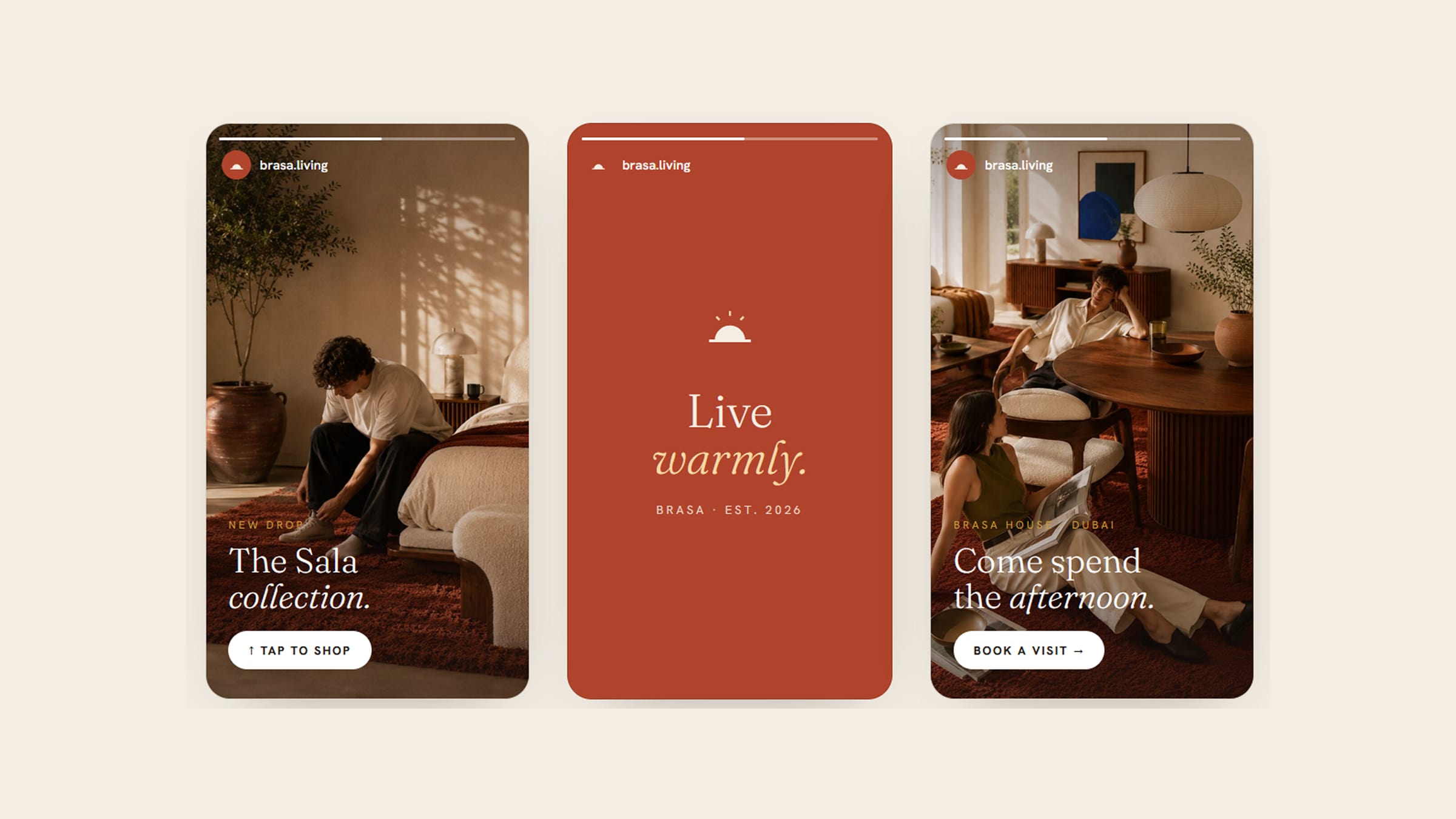
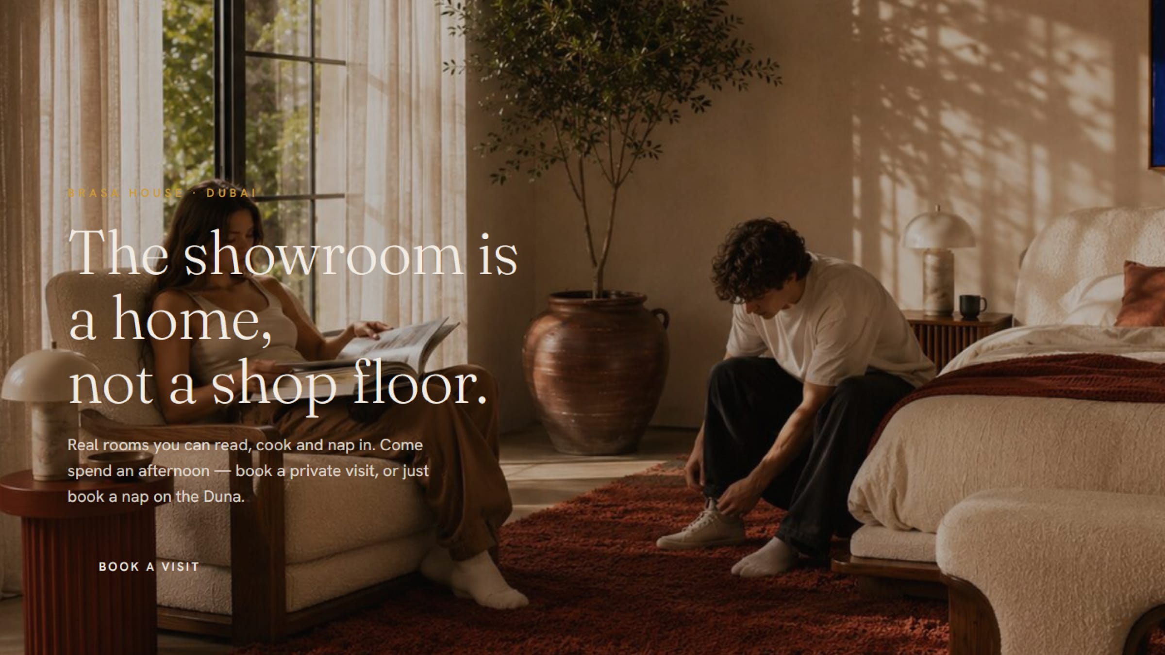
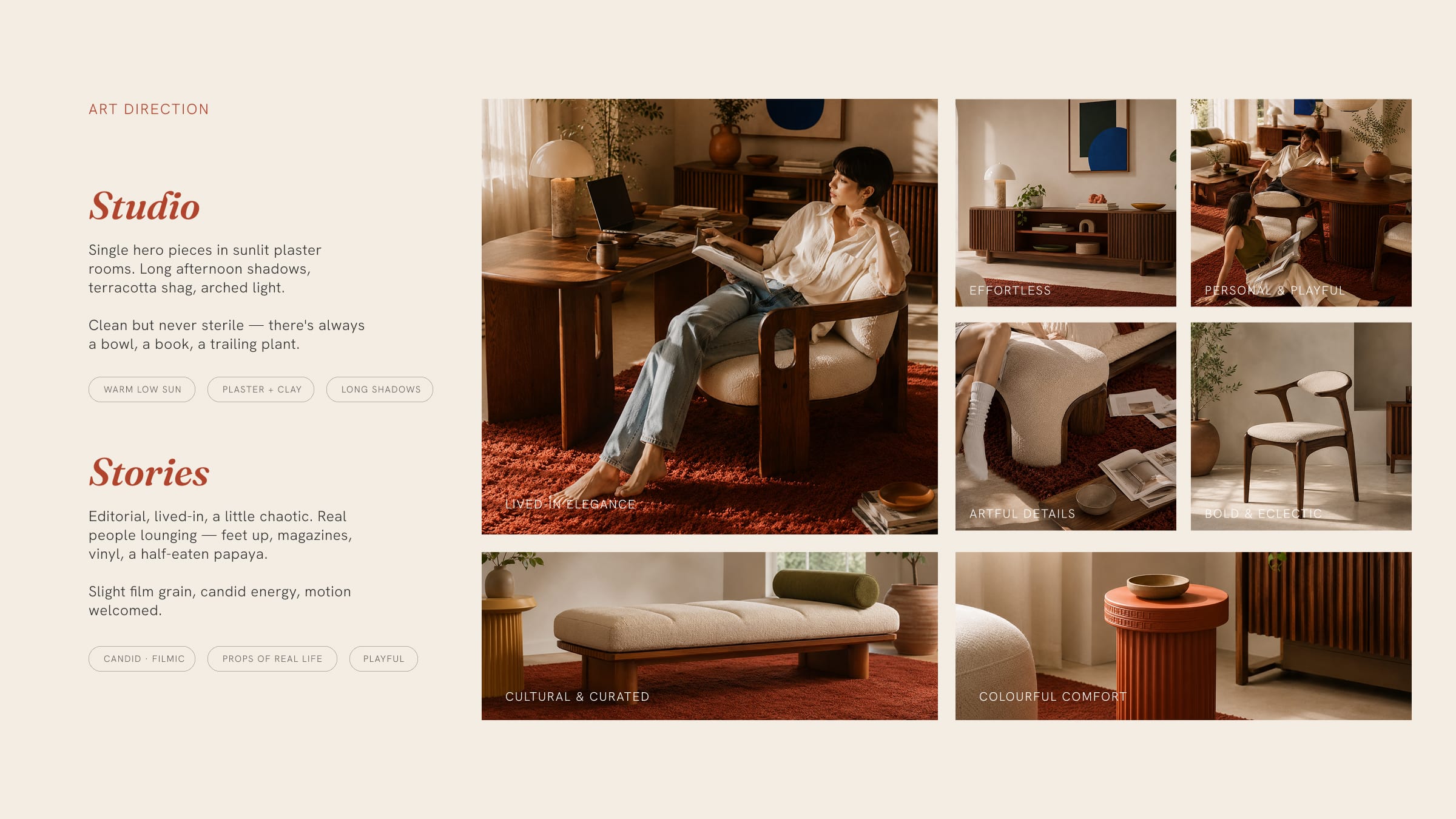
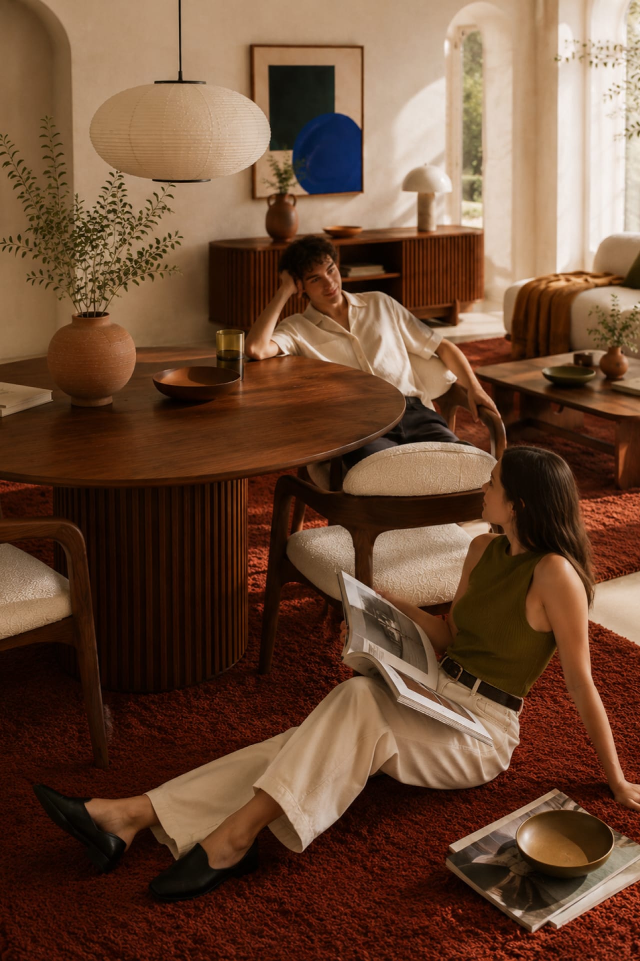
The line is organised into a named family — Curva, Onda, Pilar, Sala, Sueño — each piece given a short human descriptor rather than a spec sheet. Fraunces Light carries the logotype, high-contrast and soft-humanist, editorial without stiffness. The art direction splits between Studio, framing single hero pieces in sunlit plaster rooms with long afternoon shadows, and Stories — looser and lived-in, real people, feet up, slight film grain, candid motion welcomed.

Next project
Washline