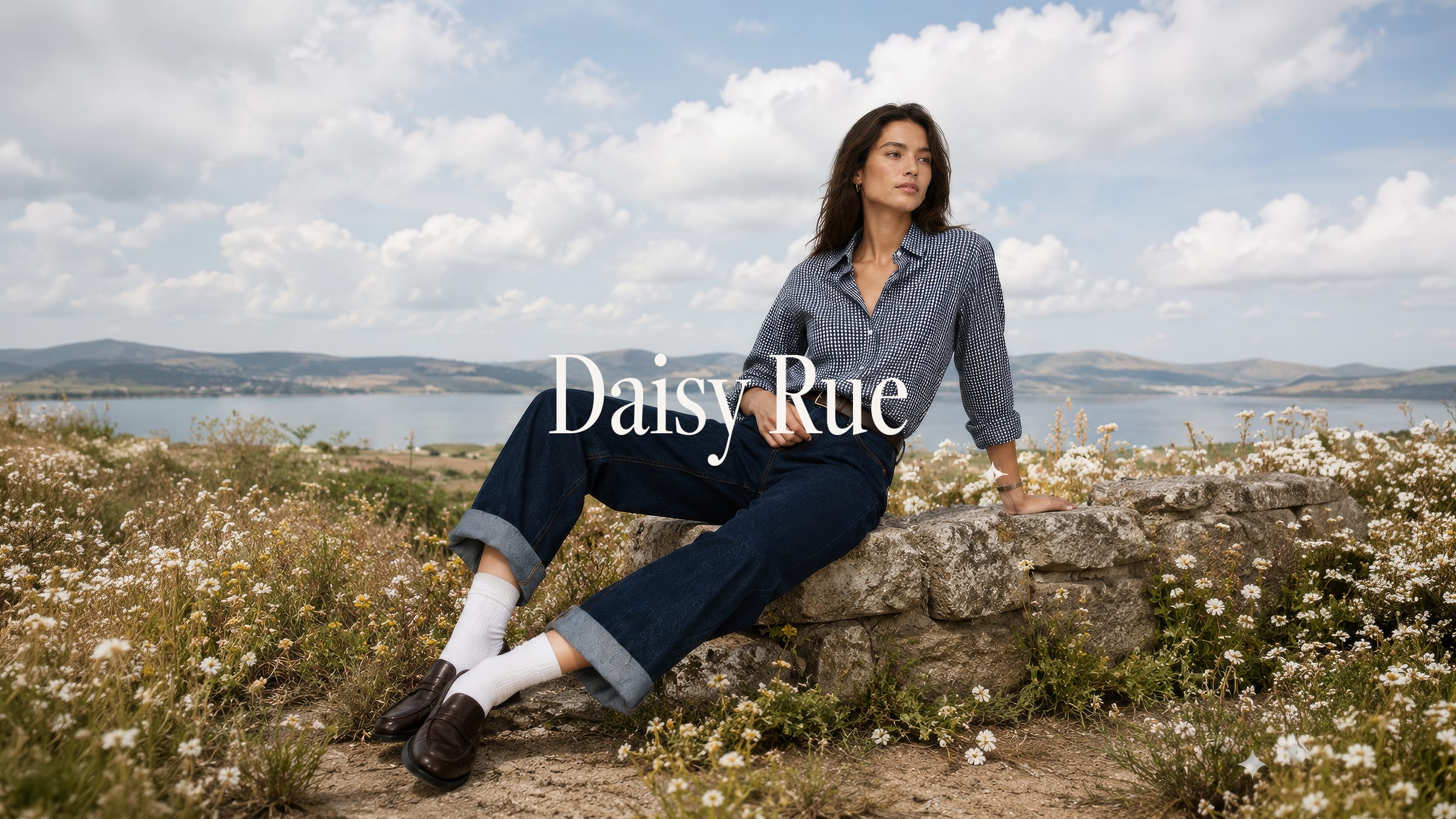
DaisyRue
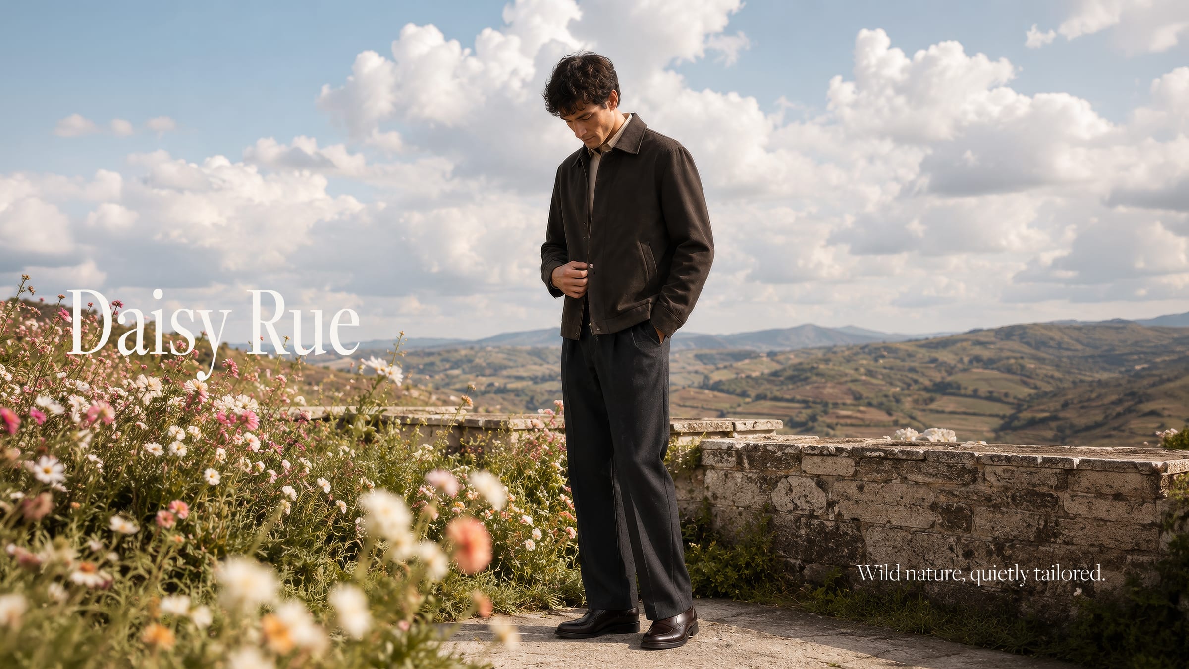
Luxury that stays close to the wild.
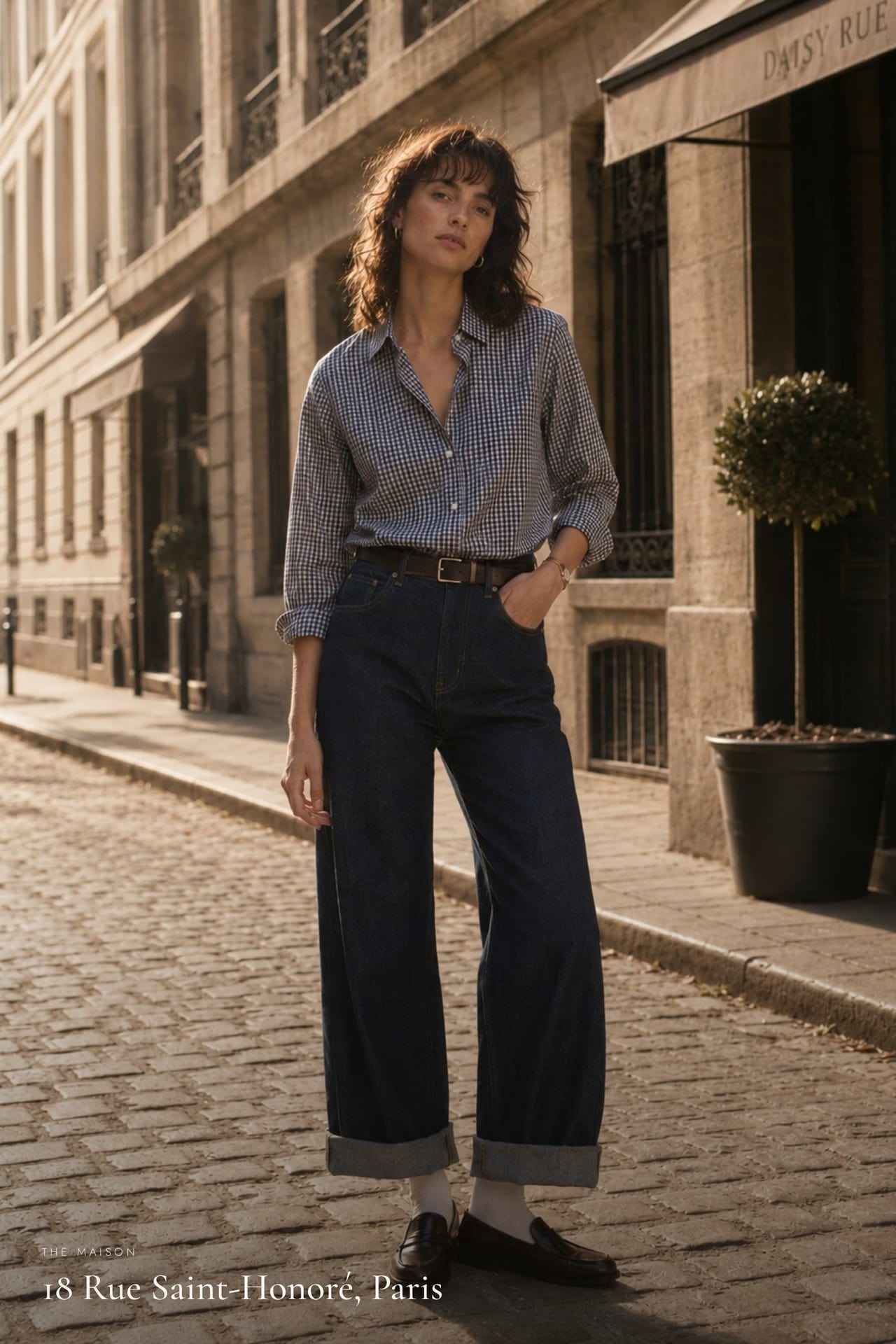
The house sits among the maisons of Rue Saint-Honoré, but its reference point is the hillside — the cobblestone, the wildflower at the edge of a stone wall. The brief was an identity holding both registers: European precision and nature left to grow on its own.
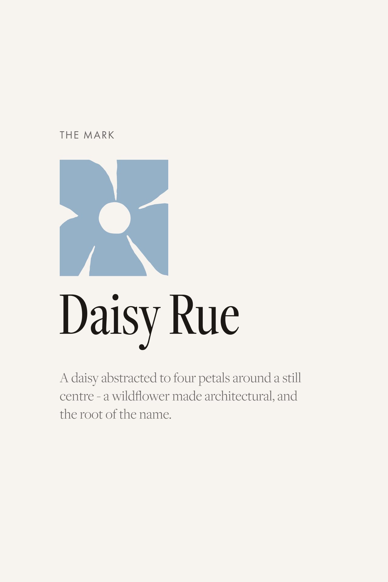
We built it around the Mark — a daisy abstracted to four petals around a still centre, architectural yet organic. A high-contrast serif and a dusk-blue drawn from the petal hold the line between editorial and earth.
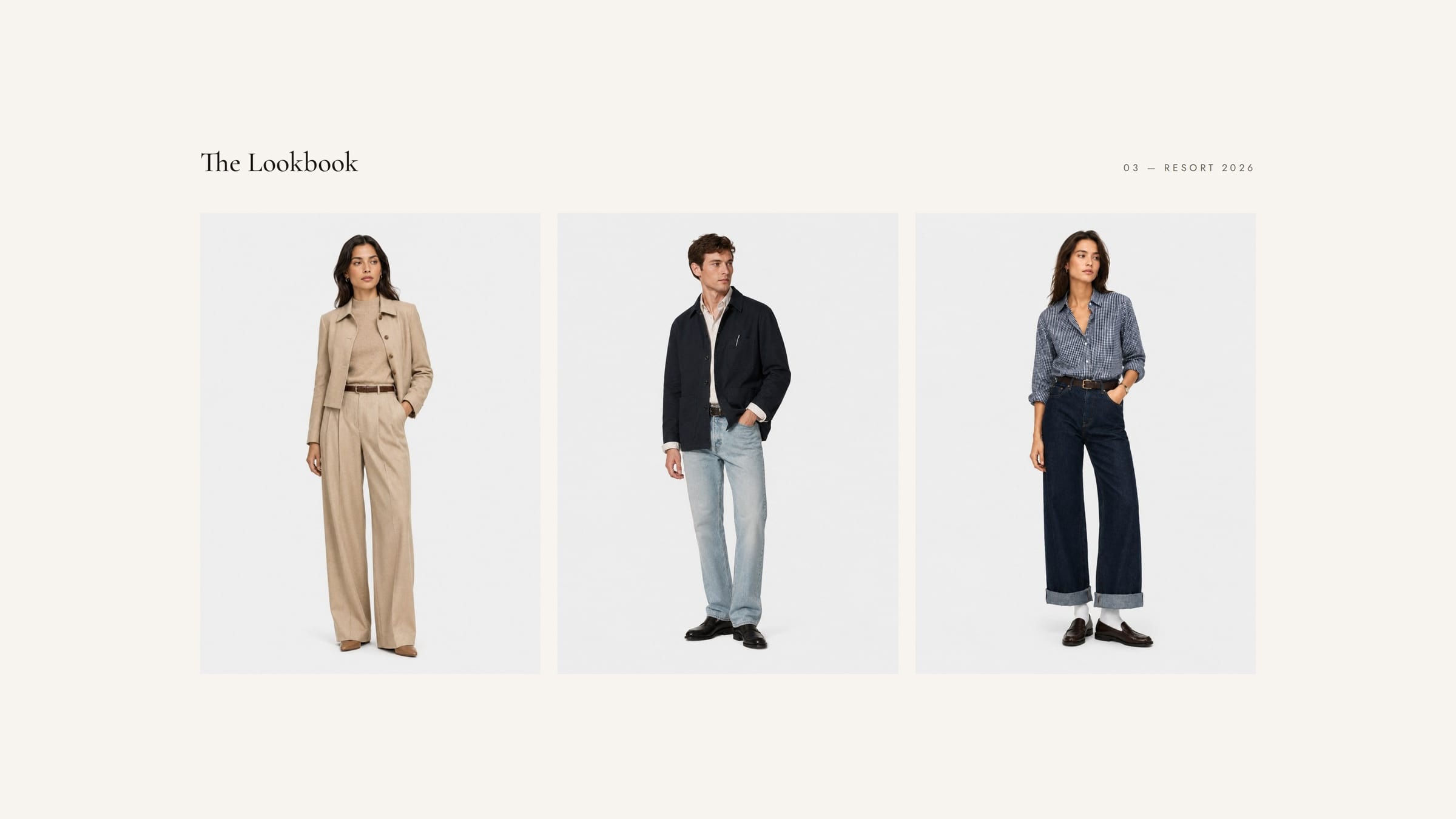

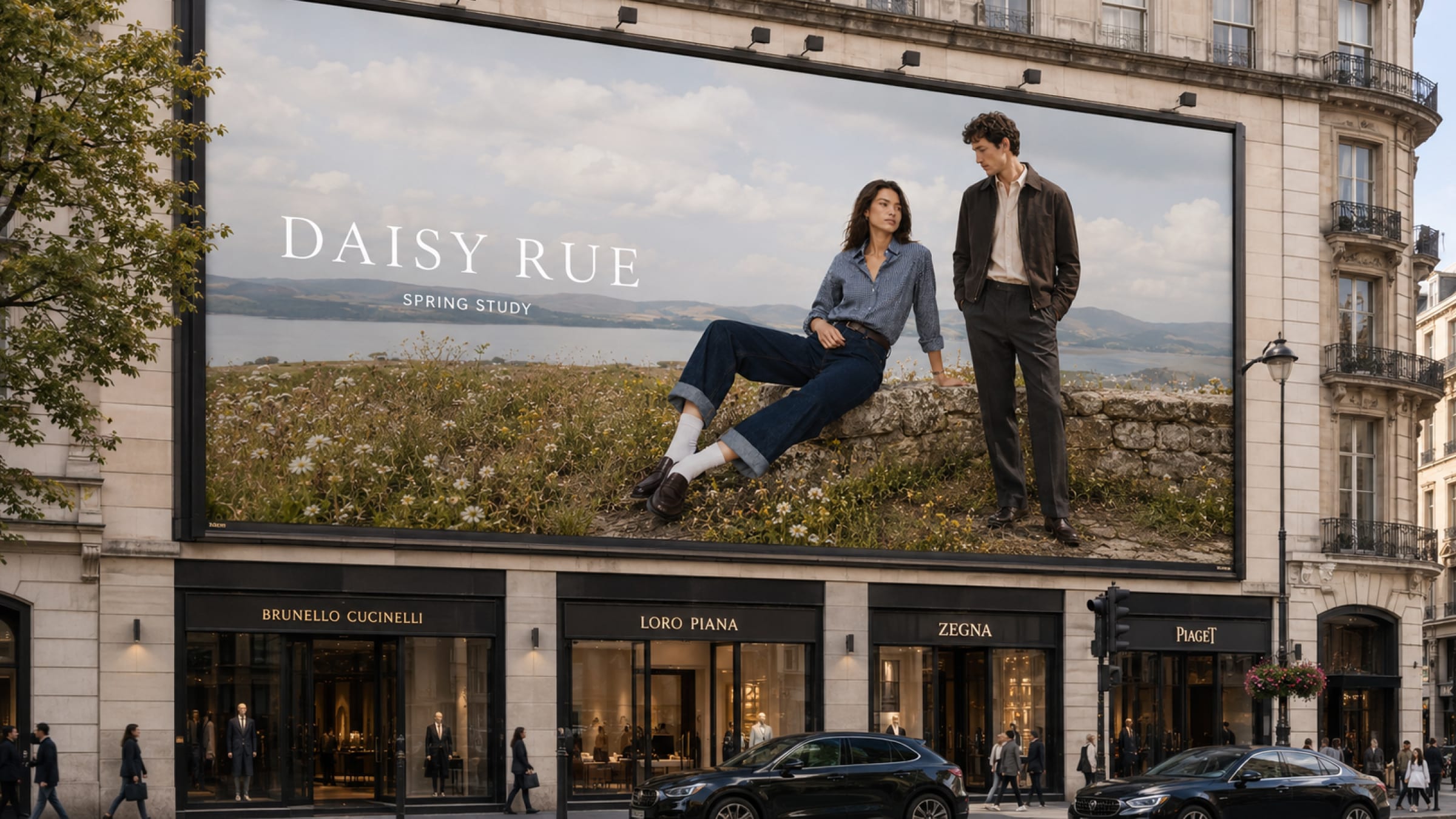
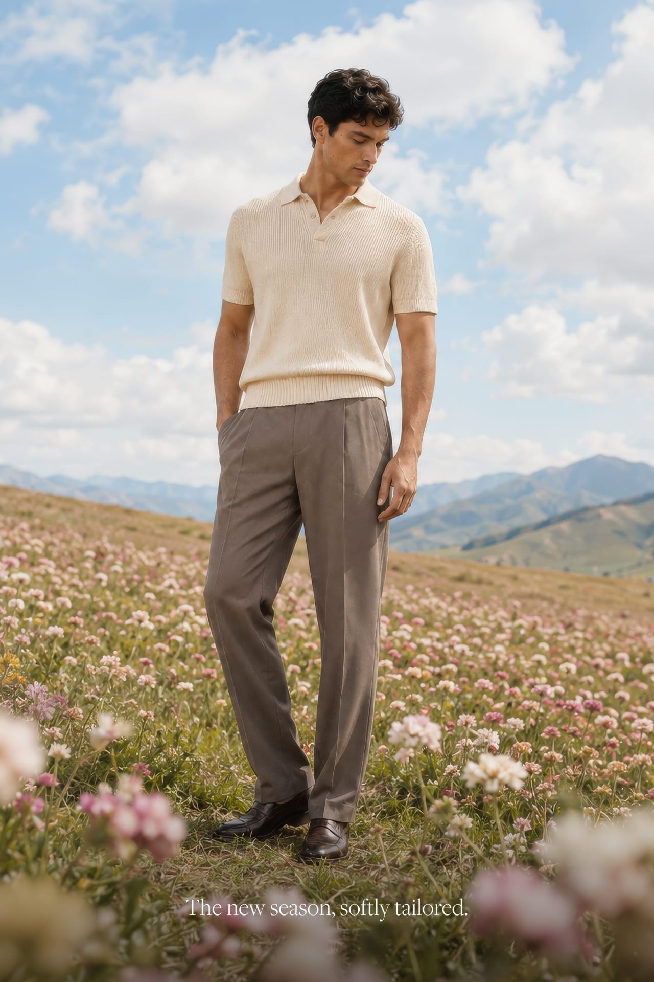
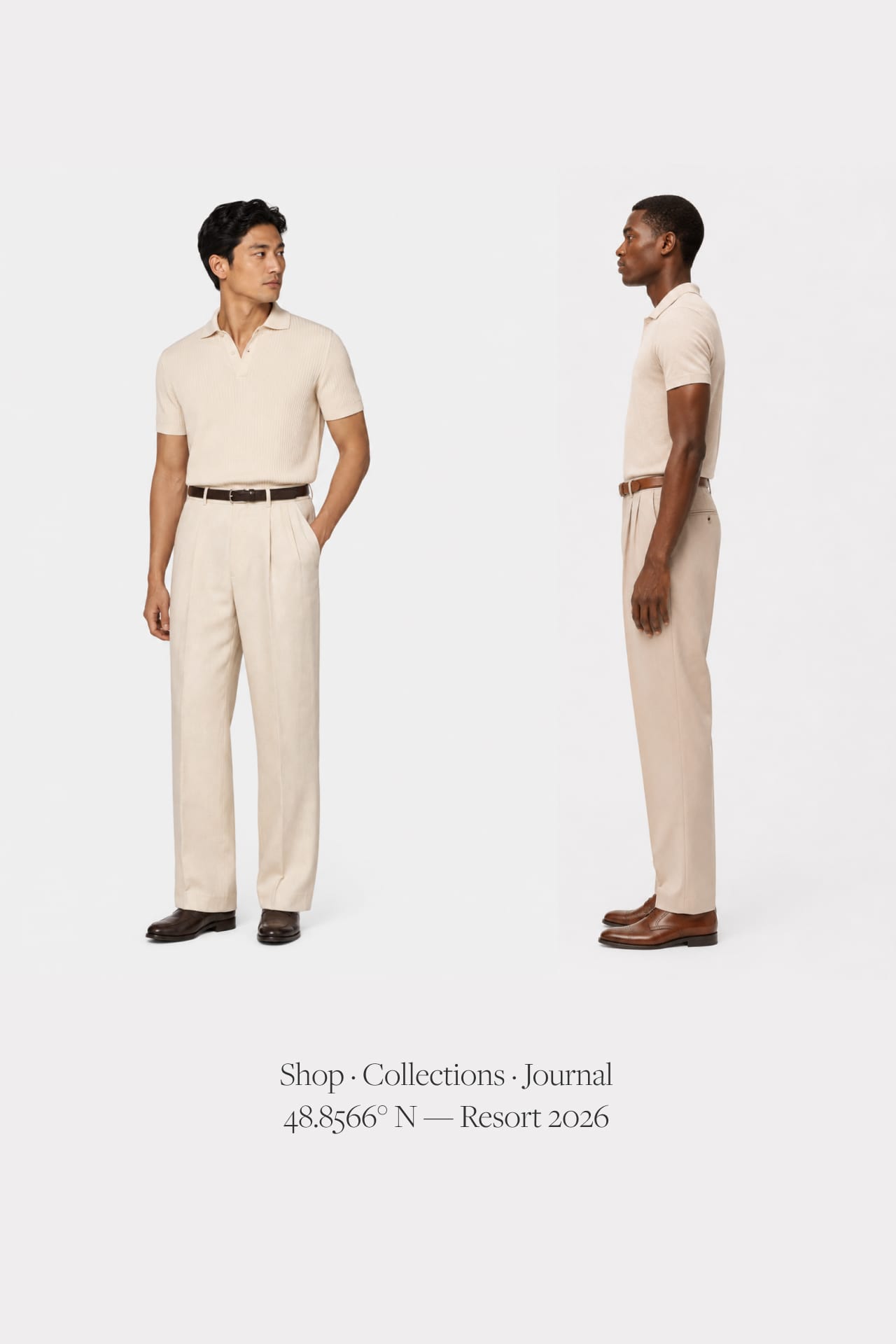
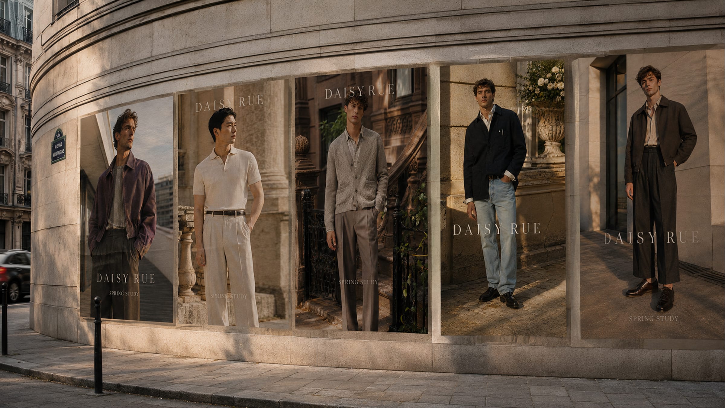
The petal mark extends into a repeating pattern that runs across linings, packaging and digital surface, while the palette stays close to the earth — stone, oat, ink denim, the muted green of a hillside — so the clothes, never the graphics, carry the colour. The photography runs two registers: Spring Study, single figures against open sky and wildflower, tailoring quiet against the landscape; and a cleaner studio lookbook, the clothes read plainly against soft grey.
Next project
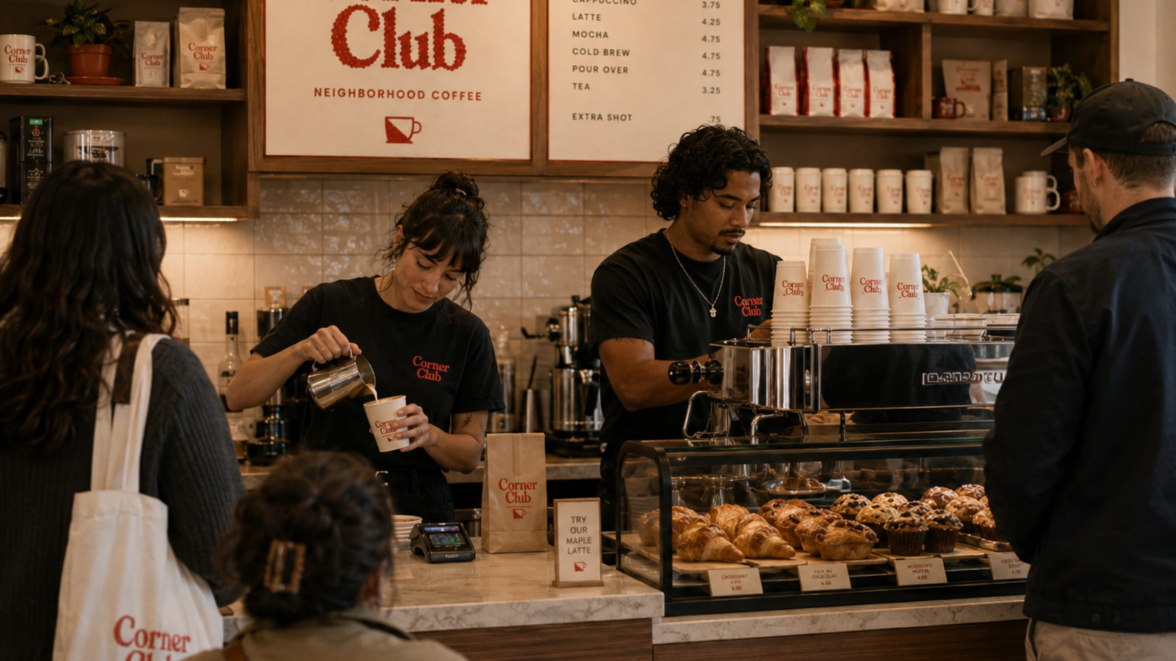
Corner Club