CornerClub
The corner shop is where a neighbourhood actually meets.
Specialty coffee splits between clinical minimalism and heritage nostalgia — neither a place you'd actually linger. Corner Club is the friendly regular's spot on the block, not the flagship: coffee, community and a little creativity at the same table.
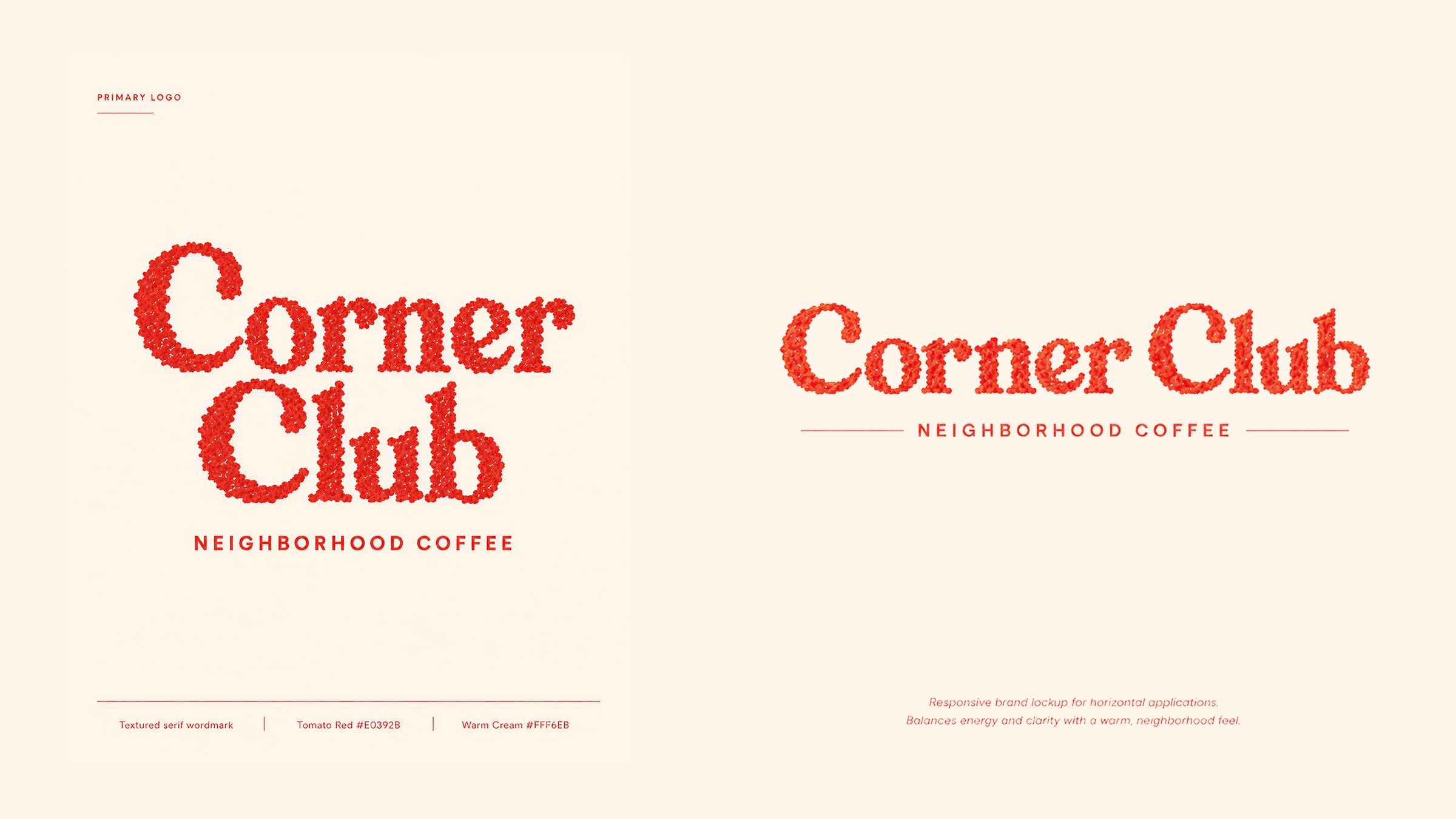
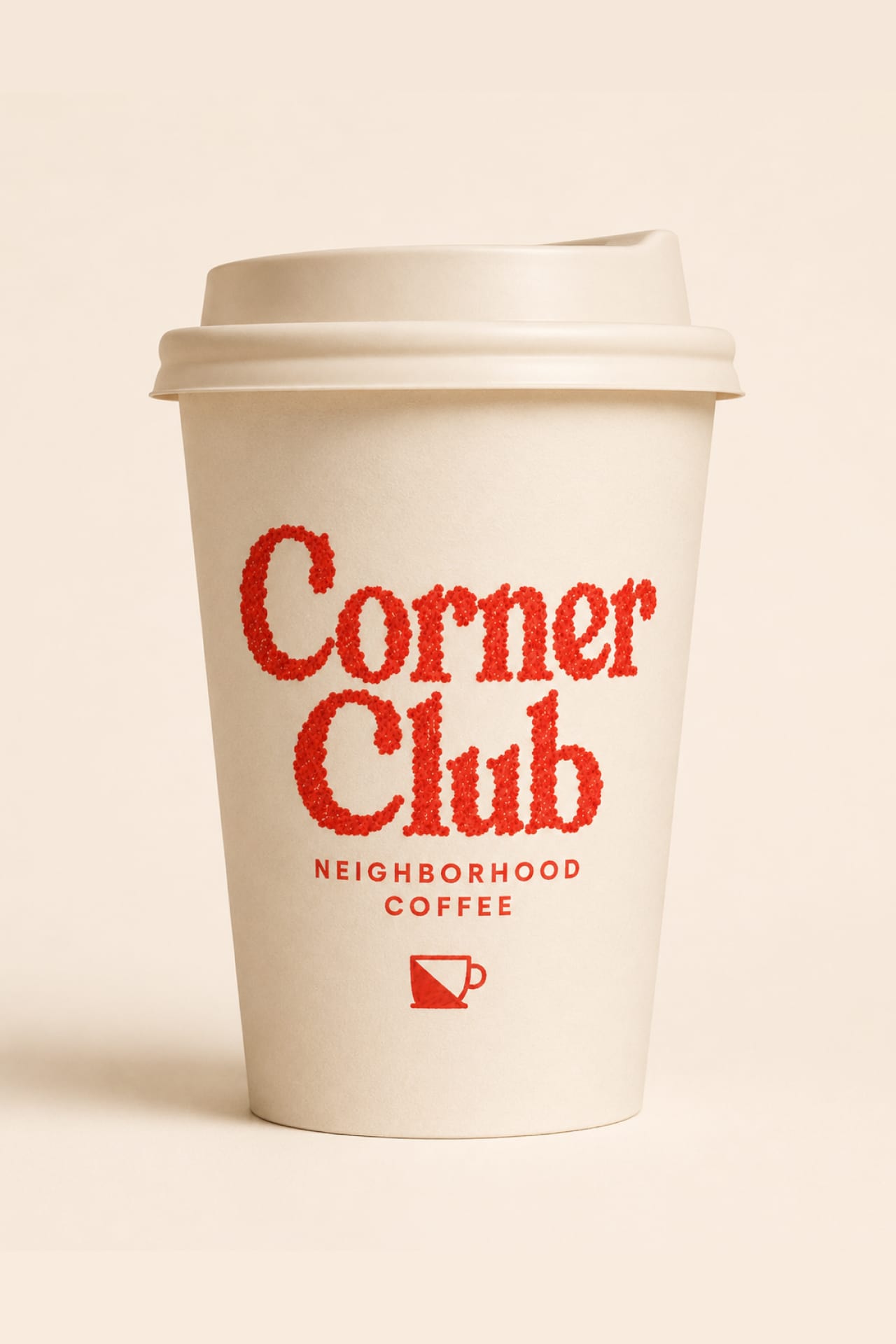
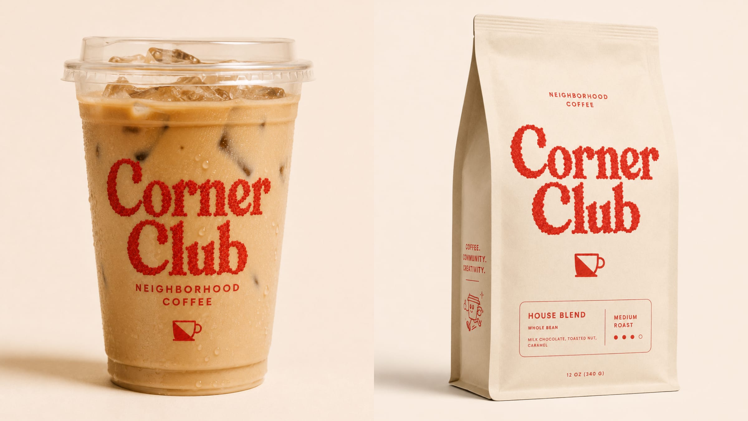
A textured serif wordmark reads warm and worn-in, paired with the Cup — a half-filled mug split on the diagonal. One tomato red against cream keeps it confident and friendly at once.
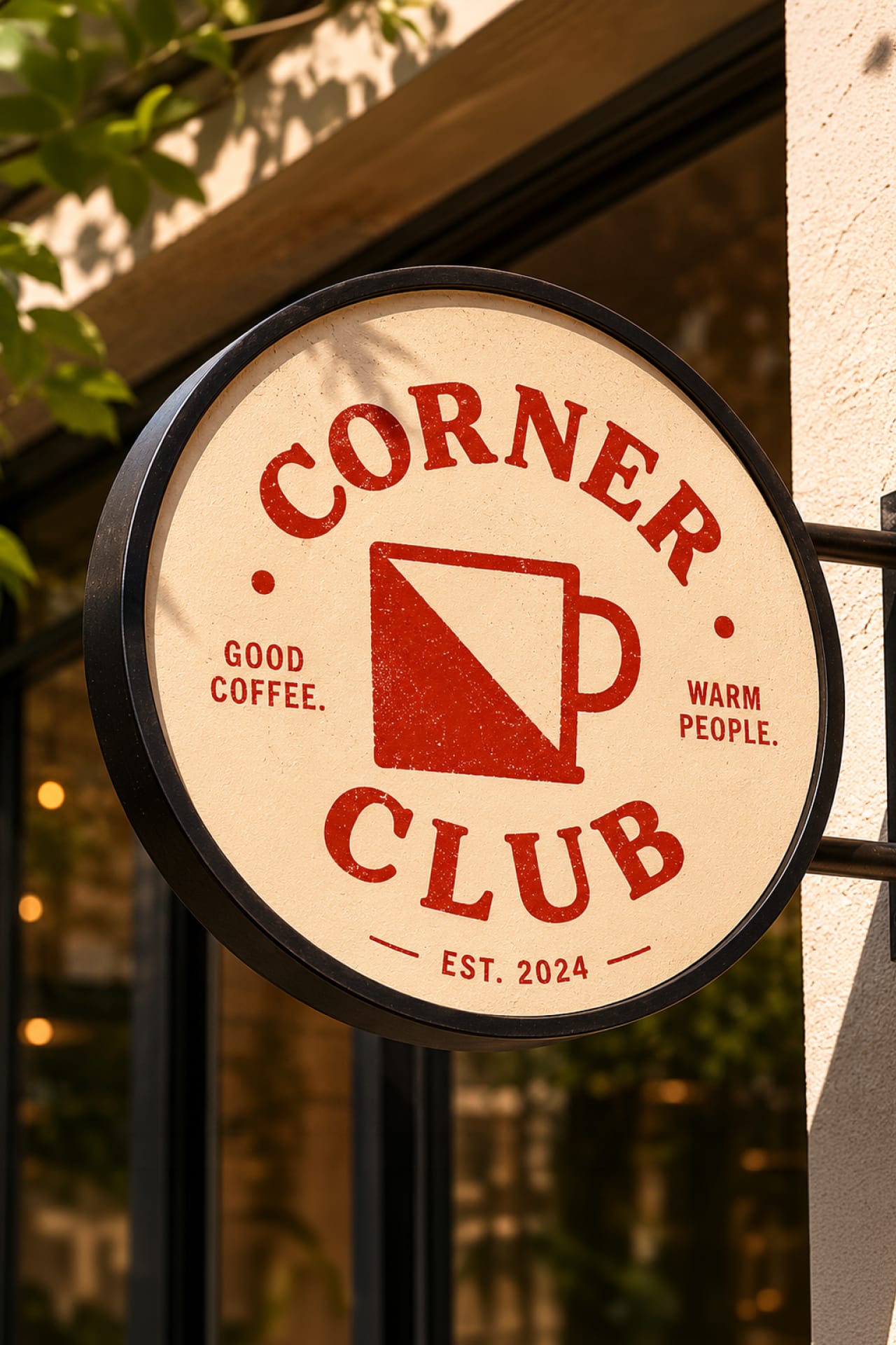
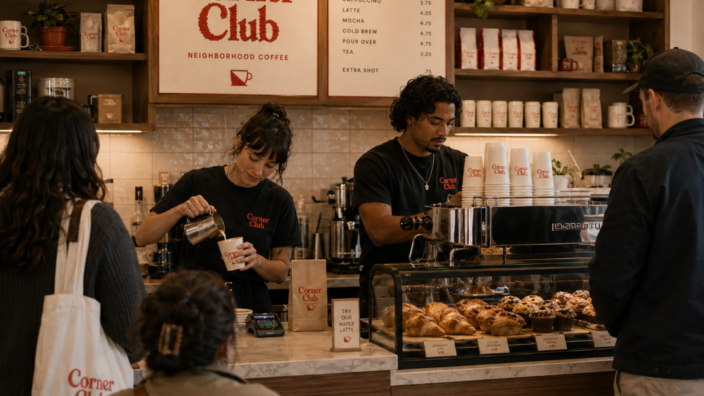
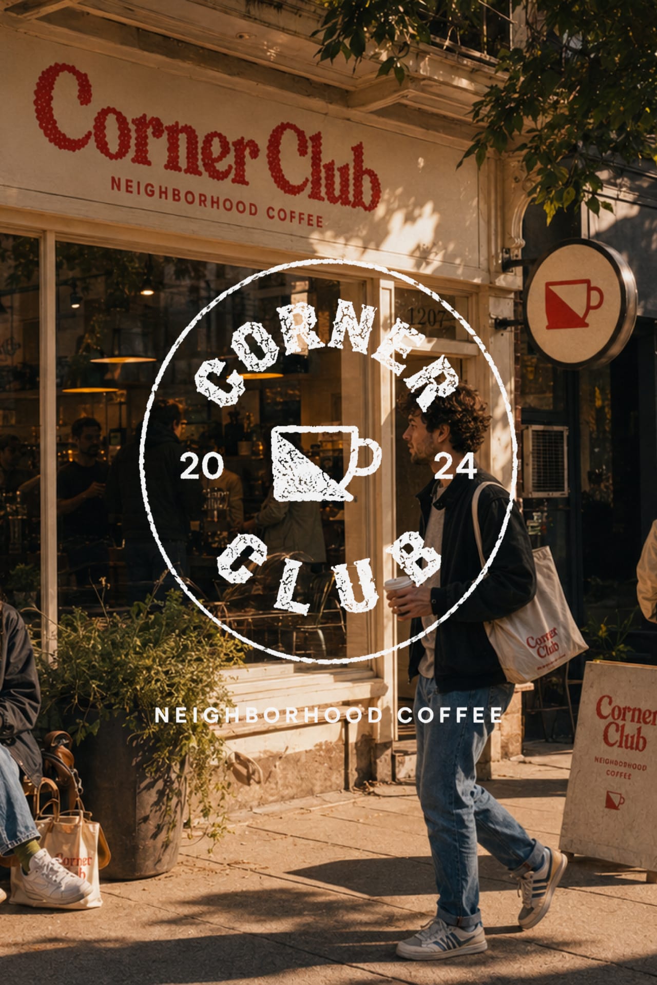
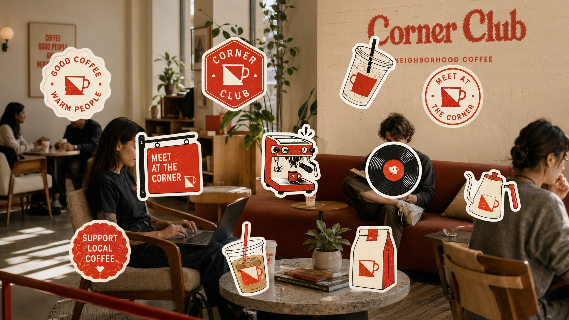
A loose library of badges, stickers and stamps — the espresso machine, the record, the "Meet at the Corner" sign — lets the brand feel hand-made and ever-expanding rather than locked down. The textured serif reads warm and worn-in, the way a sign that's been on a corner for years might. The art direction stays candid and lived-in: real regulars, laughter, pastries mid-bite, warm afternoon light through the window.

Next project
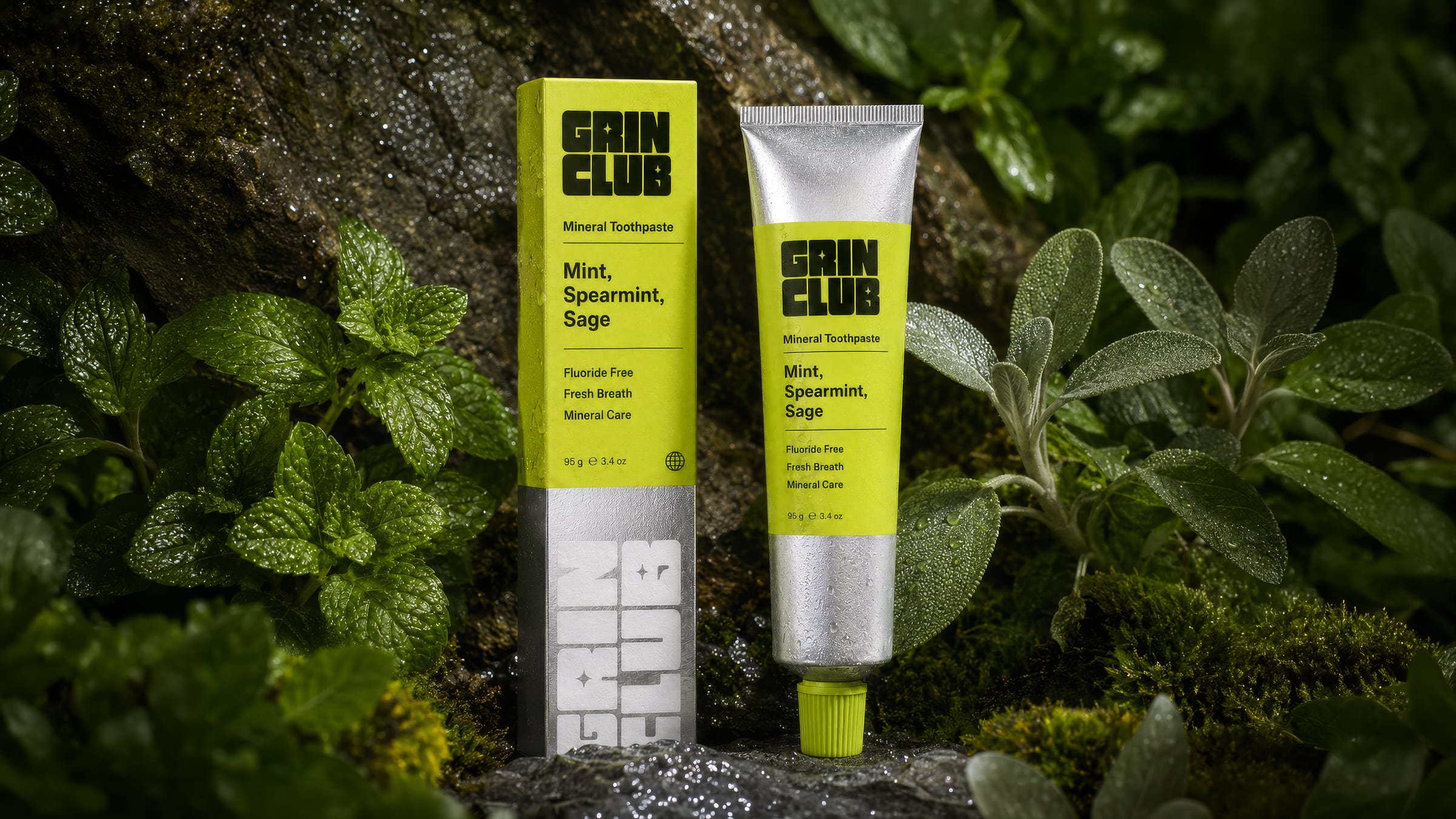
Grin Club