GrinClub
The most boring two minutes of your day, worth looking forward to.
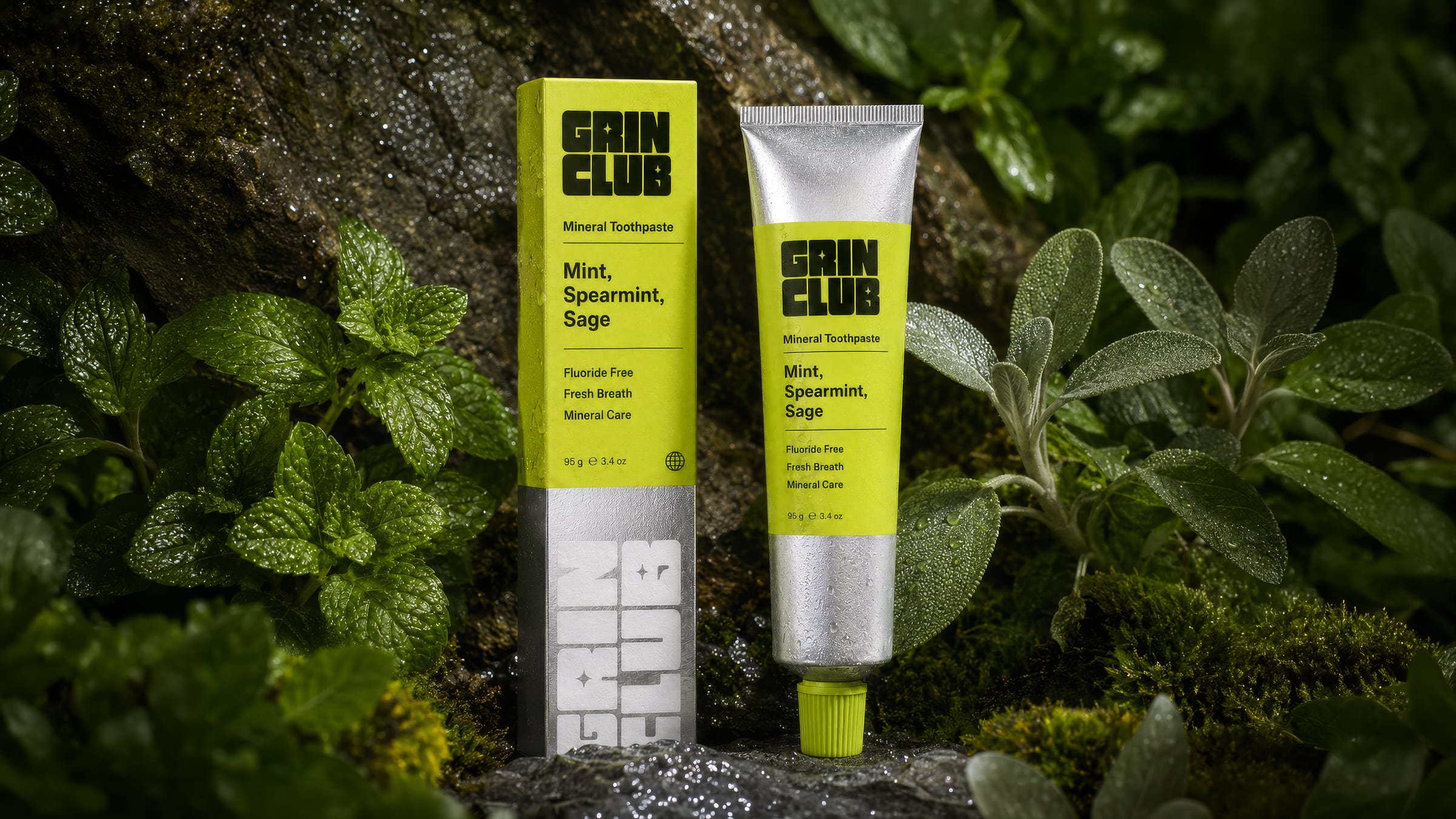
The oral-care aisle is stuck between pharmacy white and muted wellness sage — two ends of the same quiet shelf. Grin Club makes noise without losing the credentials: a fluoride-free, mineral toothpaste that takes its formula seriously but refuses to be sleepy.
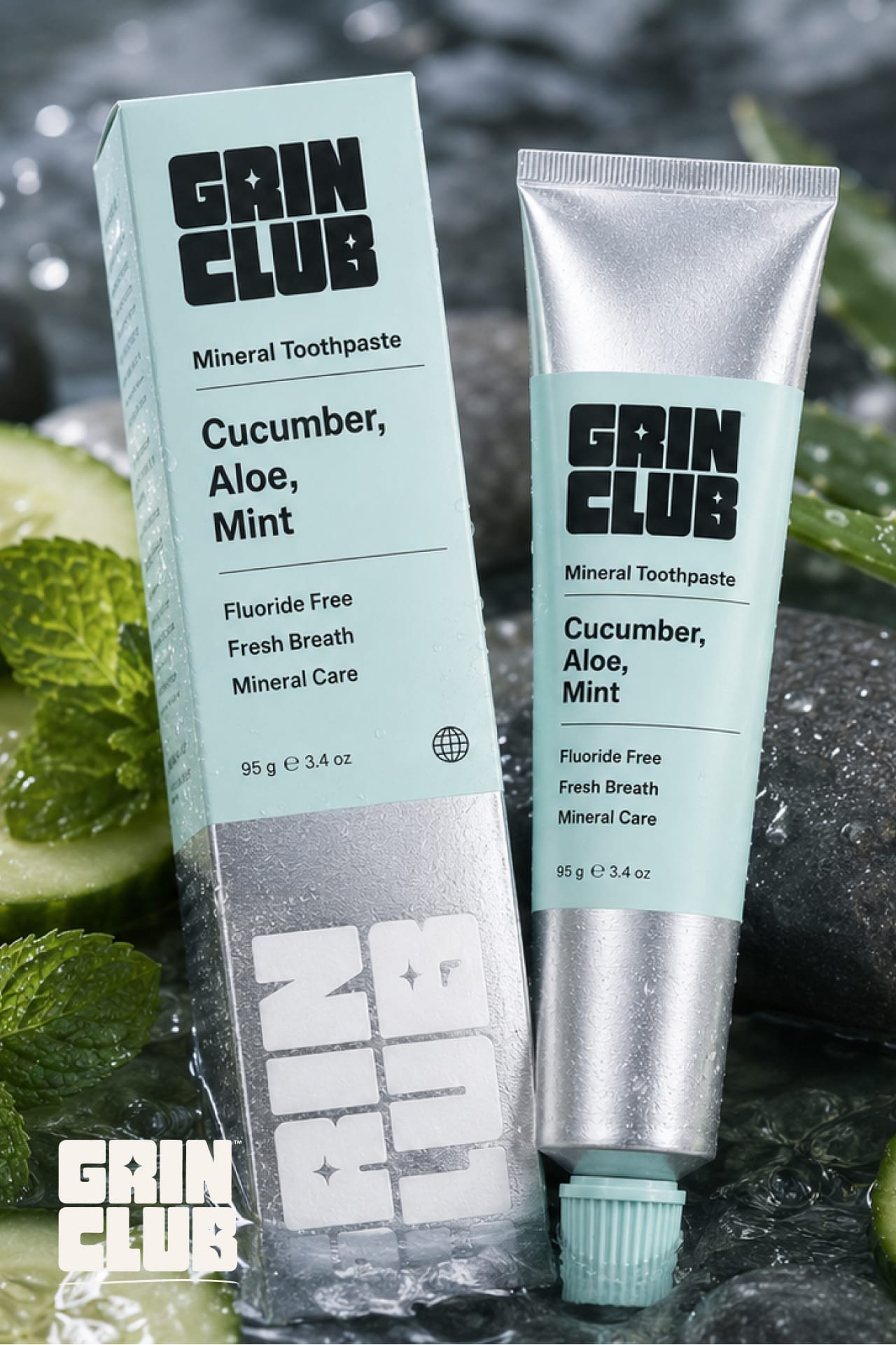
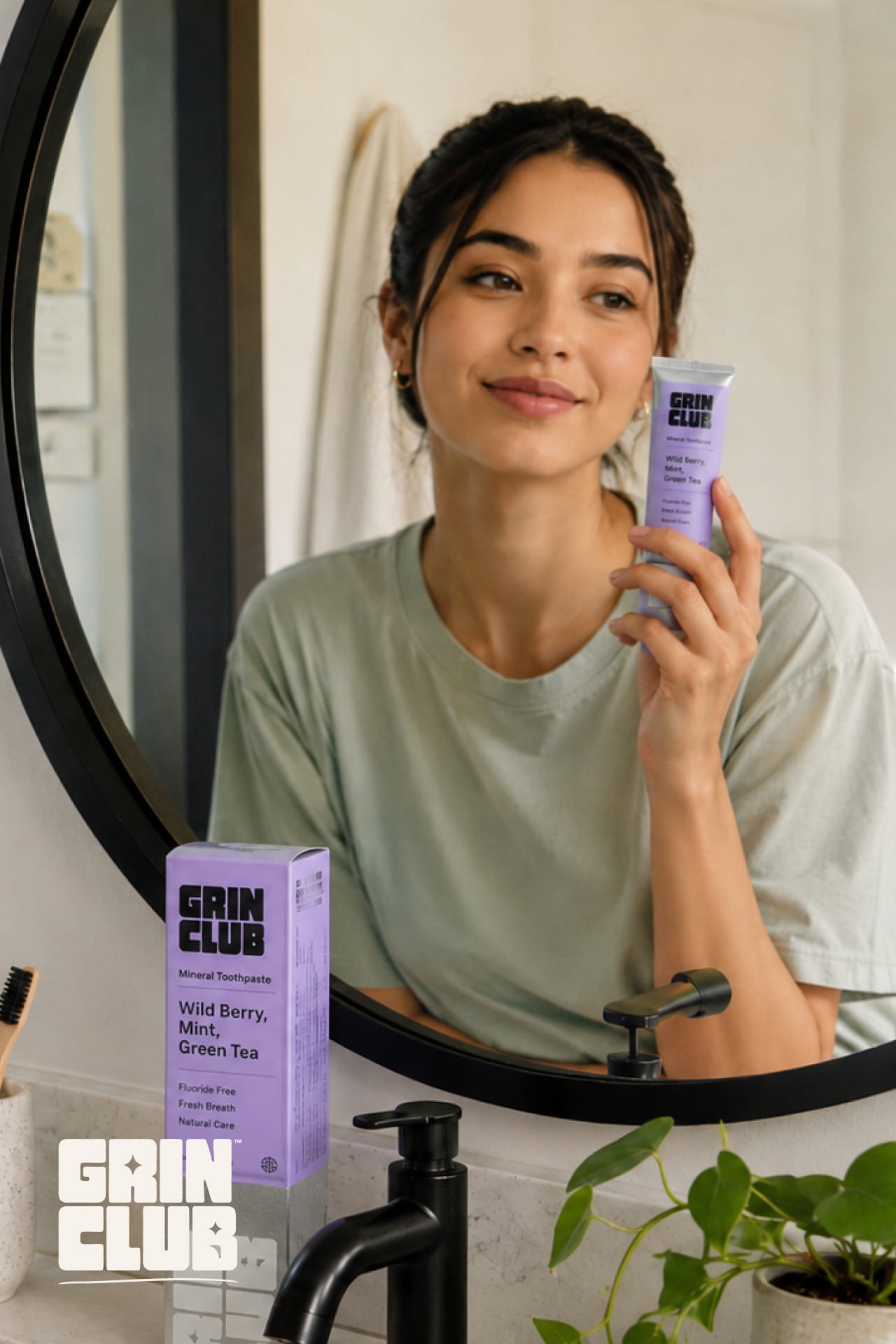
A heavy rounded logotype with a sparkle cut into the letterforms sits over flavour-coded fields — lime, lilac, aqua, sunshine — while a metallic tube keeps it premium, not novelty.
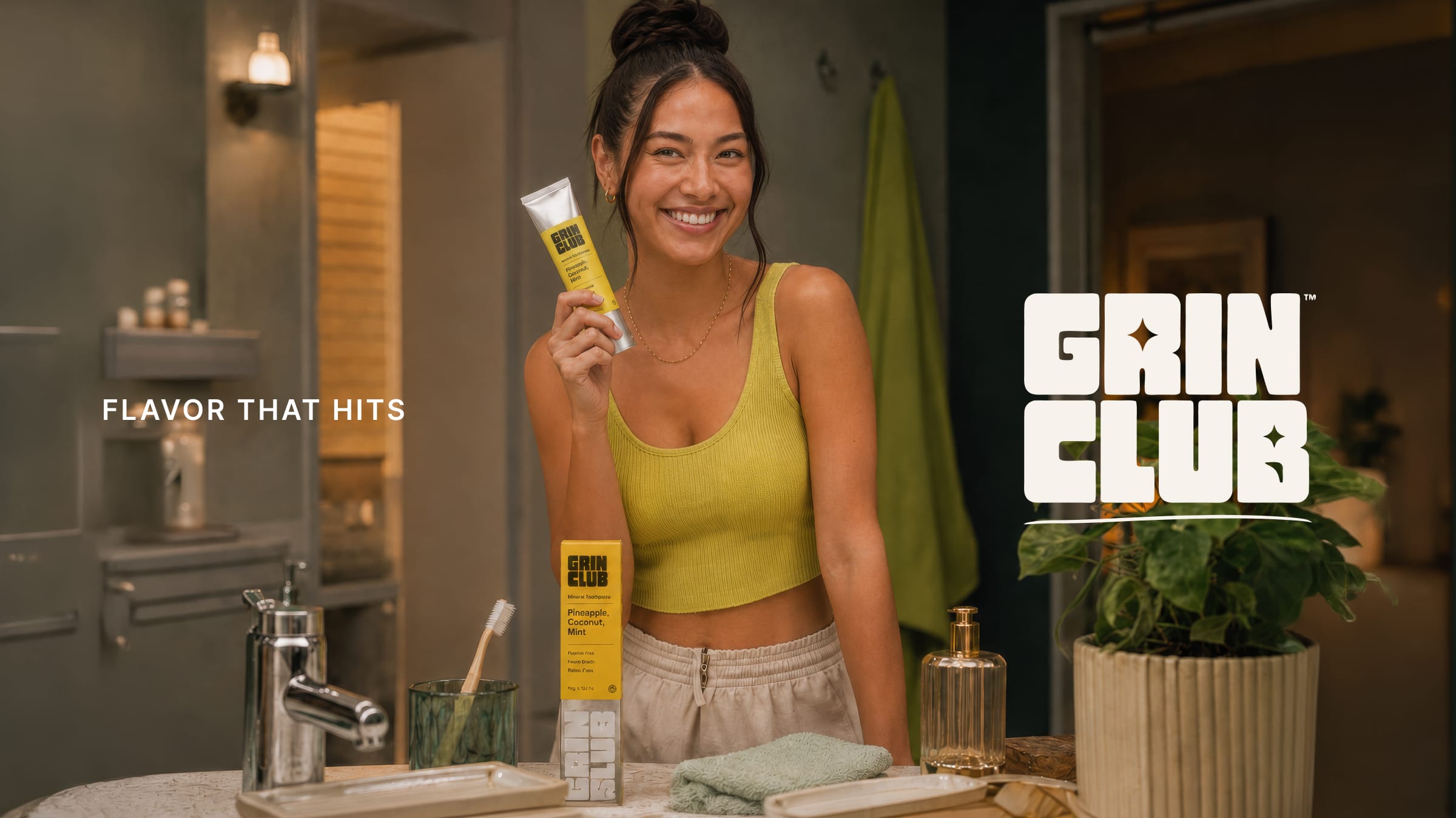
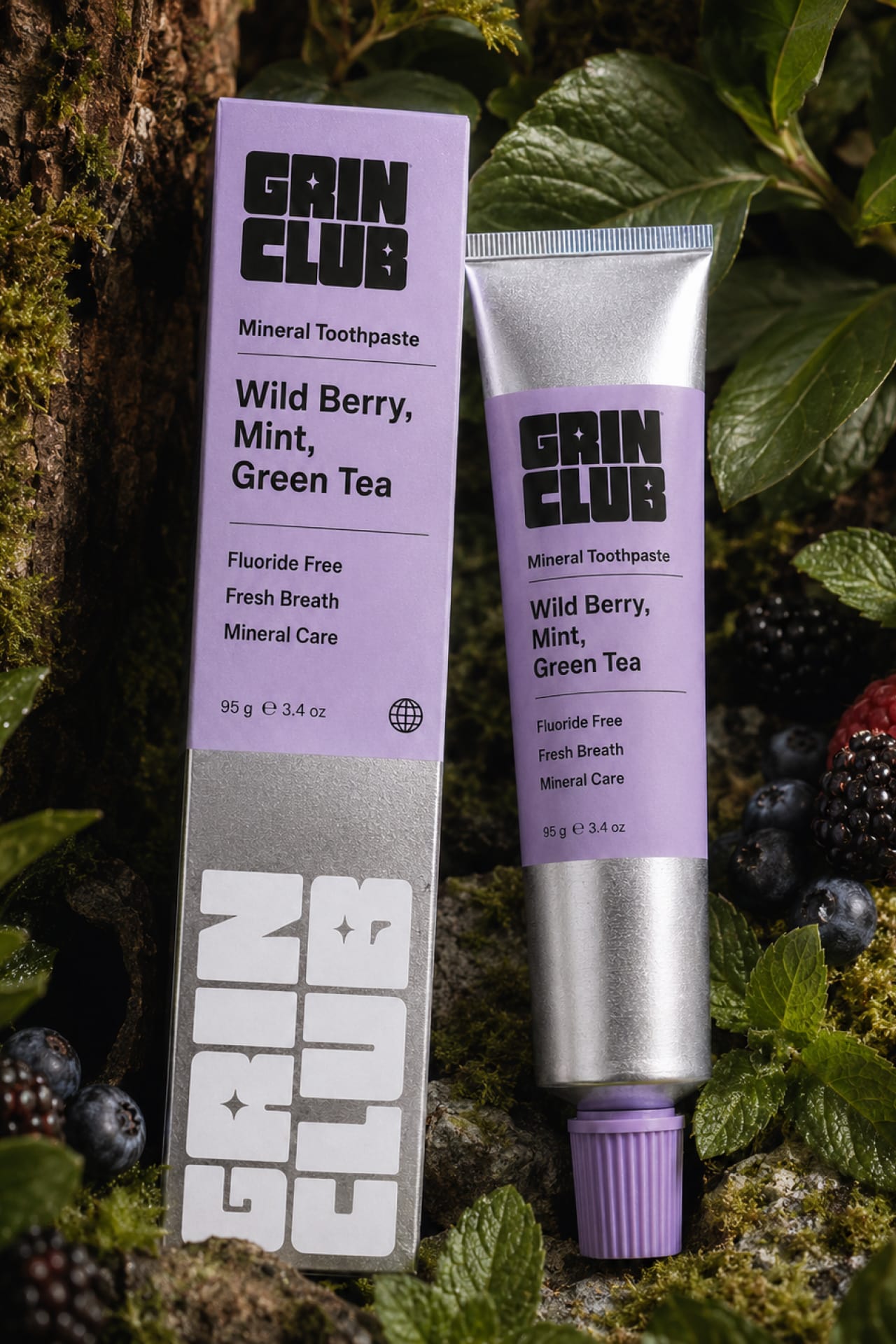
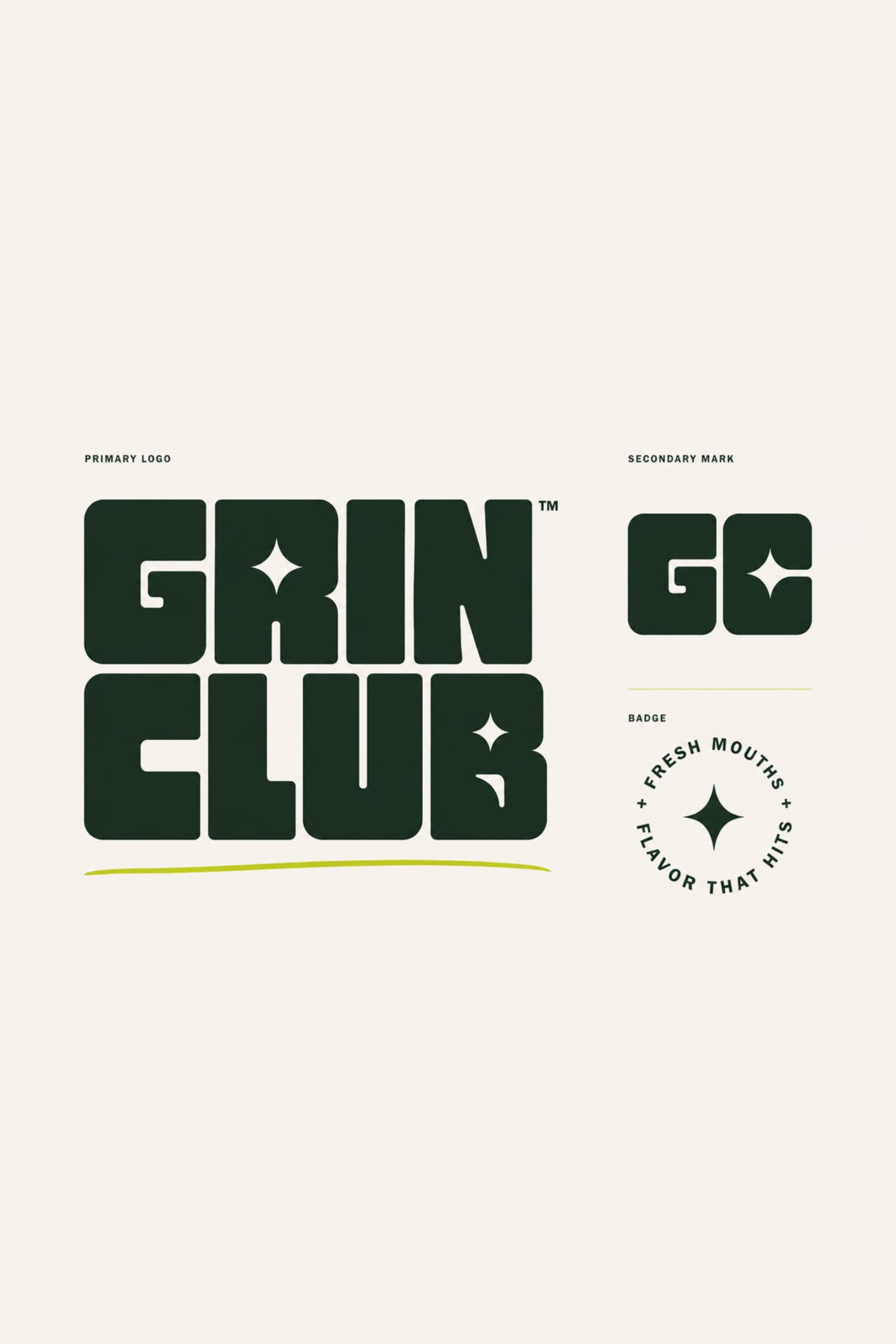
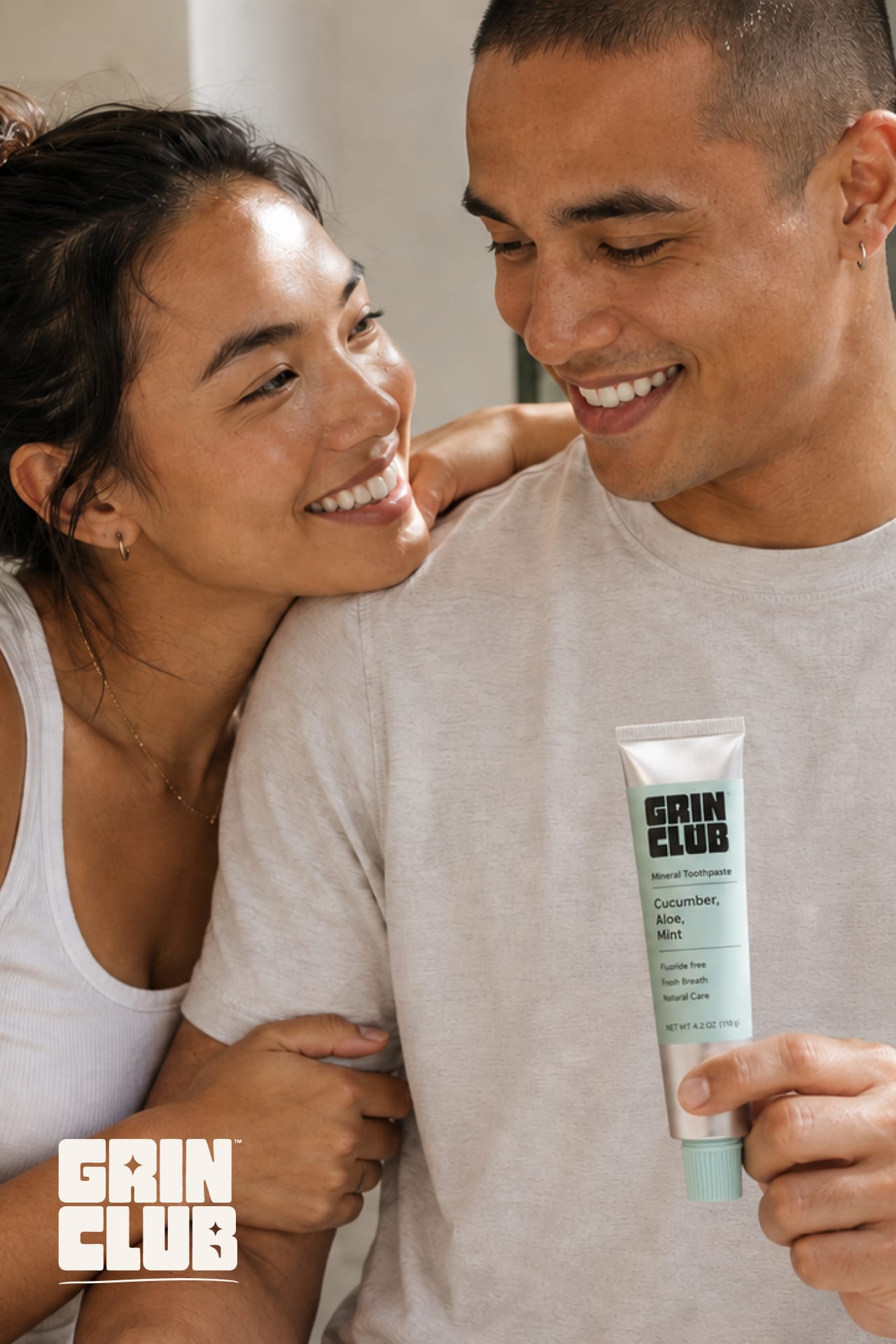
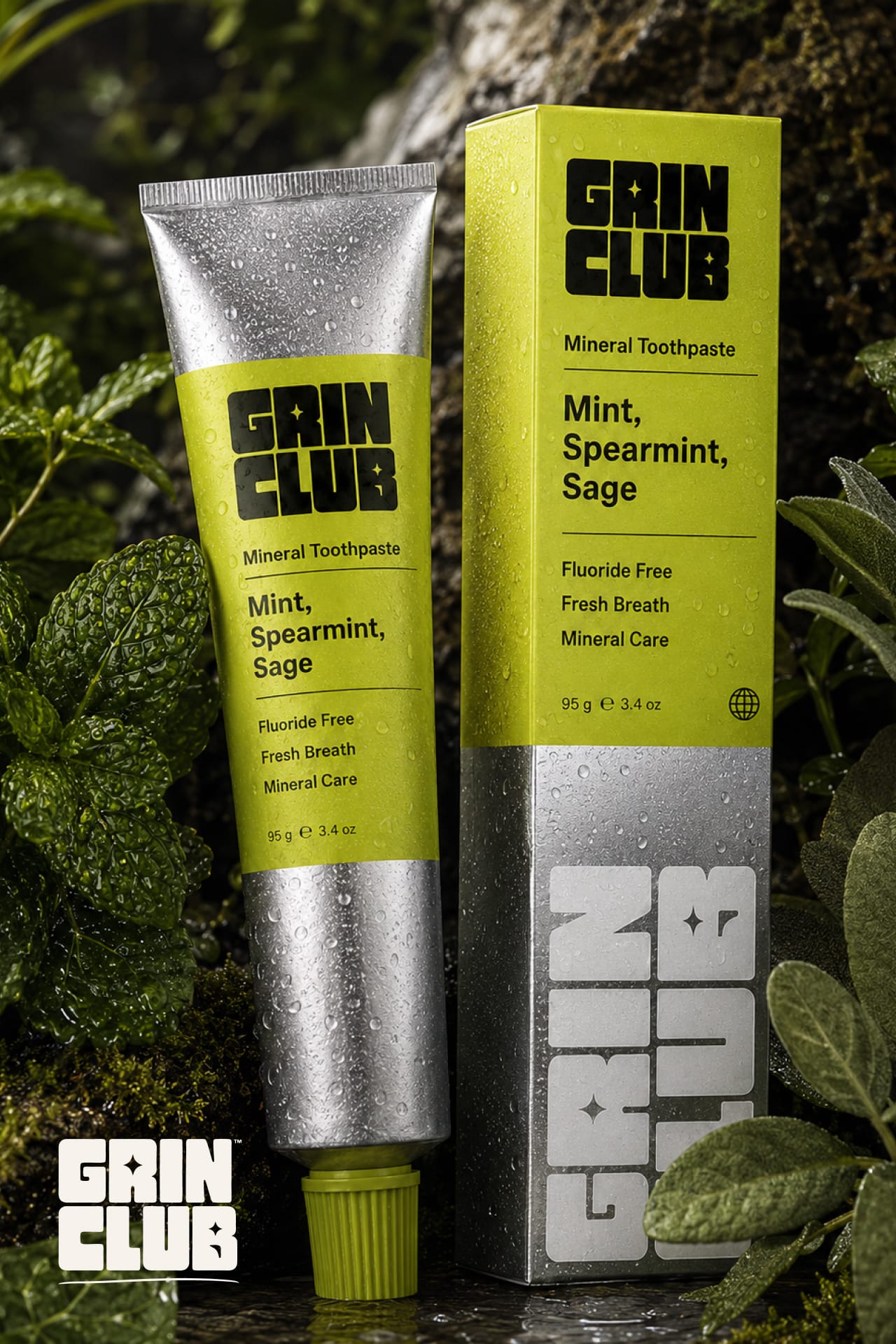
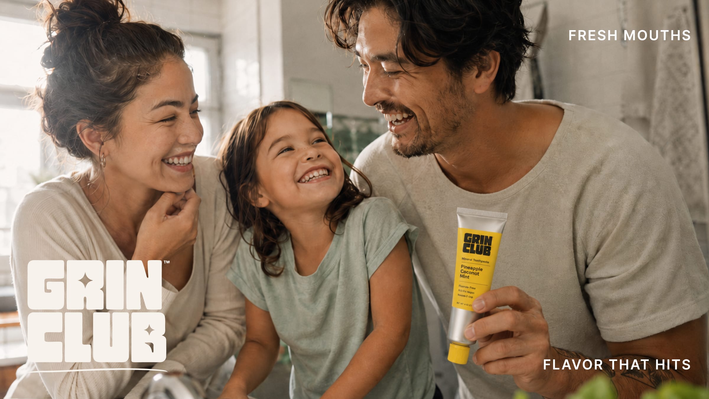
A heavy rounded logotype with a four-point sparkle cut into the letterforms turns the glint of a clean tooth into the mark, compressing into a GC monogram for the smaller moments. The product photography leans dramatic and botanical — tubes staged in wet moss, mint, sage and wild berry, the ingredients made cinematic — while the lifestyle work stays bright and human: real bathrooms, real grins, families mid-laugh with a tube in hand.

Next project
Soul Studio